Choosing the Right Chart Type for Your Research Data
November 19, 2024 | by Jean Twizeyimana
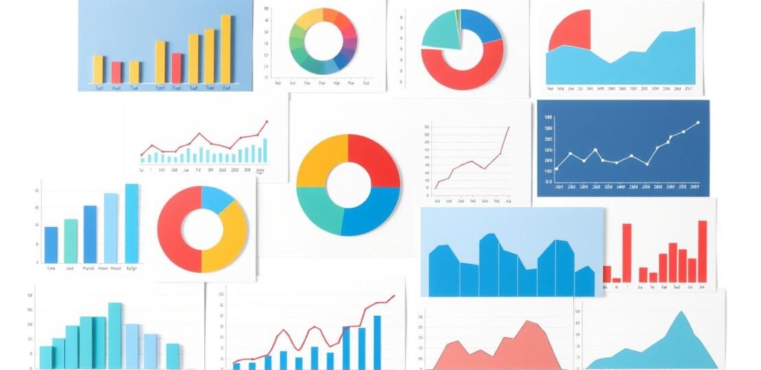
I know how key it is to share research data well. Charts and graphs are great for making complex info easy to get. But picking the right chart is very important.
There’s no single chart for all data. First, decide what message you want to share. Then, pick a chart that fits your goal. Think about your data, who you’re talking to, and why you’re showing it.
Key Takeaways
- Selecting the right chart type is essential for effectively communicating research data.
- Charts help people understand complex information, identify patterns, and draw meaningful insights.
- Consider the type of data, intended audience, and purpose when choosing a chart type.
- Defining the central message and insights you want to convey is the first step in selecting the appropriate visualization.
- Utilize a variety of chart types, including comparison, relationship, and composition charts, to tell a compelling data story.
Understanding the Importance of Chart Types
Data visualization makes complex info easy to see and understand. Charts help us spot patterns and trends. They also tell stories with data. This makes it easier to make good choices.
Why Visualization Matters in Research
Charts and graphs are key in data analysis. They turn raw data into pictures that tell a story. This way, researchers share their findings better.
Charts show trends and compare things. They help find connections in data that’s hard to see otherwise.
The Role of Data Presentation in Decision-Making
Good data presentation is key for smart choices. Charts and visuals make complex info simple. This helps everyone understand the main points fast.
This understanding leads to better decisions. Decisions based on clear data are more reliable.
Different charts do different things in data analysis:
- Comparison charts, like bar graphs and column charts, are great for comparing values across categories.
- Relationship charts, like scatter plots and bubble charts, are useful for visualizing the relationship between two variables.
- Composition charts, including pie charts and treemaps, are ideal for showing the proportional makeup of a dataset.
- Distribution charts, such as histograms and box plots, are effective in highlighting the distribution and spread of data points.
Knowing what each chart does helps pick the right one. This way, researchers can share their insights clearly. This supports smart decision-making.
Key Factors to Consider When Choosing a Chart
Choosing the right chart type is key to showing your data well. There are important things to think about when picking a chart.
Type of Data: Categorical vs. Numerical
First, figure out what kind of data you have. Is it groups or categories, or numbers? This helps pick the right chart. For groups, use bar or pie charts. Numbers are better with line or scatter plots.
Audience: Who Will View Your Data?
Think about who will see your data. Are they experts or need simple charts? Choose charts that fit your audience’s needs.
Purpose: Inform, Persuade, or Analyze?
What do you want to do with your data? Do you want to tell, convince, or analyze? Each chart type is good for something different. Bar charts are great for telling, while scatter plots are for analyzing.
| Data Type | Suitable Chart Types |
|---|---|
| Categorical | Bar charts, Pie charts |
| Numerical | Line charts, Scatter plots |
Think about your data, audience, and purpose. This helps pick the best chart to share your findings.
Exploring Common Chart Types
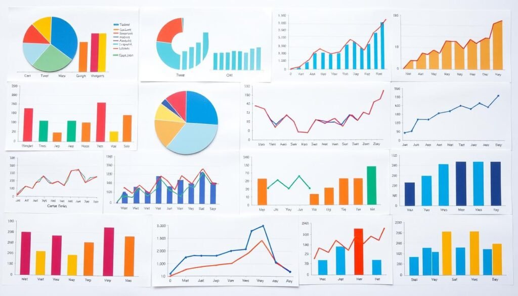
There are a few chart types that are very popular and useful. Bar charts, line charts, and pie charts are great for showing data in different ways. Knowing when to use each can help you pick the best one for your data.
Bar Charts: Great for Comparing Values
Bar charts are perfect for comparing things. They can be up and down or side to side. You can also group them to show more comparisons.
They are great for showing rankings, how things are spread out, and how often something happens.
Line Charts: Ideal for Trends Over Time
Line charts are best for showing changes over time. They help us see how things move or change. This makes them good for spotting patterns and predicting the future.
They are also good for comparing different things side by side.
Pie Charts: Best for Showing Proportions
Pie charts are best for showing how big each part of a whole is. They help us see how things are spread out. But, it’s best to keep them simple with just a few parts.
Each chart type has its own special use. Knowing what each can do helps you choose the right one for your data. This makes your data easier to understand and share.
| Chart Type | Best Use | Key Attributes |
|---|---|---|
| Bar Chart | Comparing values across categories | Vertical or horizontal orientation, grouped or stacked |
| Line Chart | Visualizing trends over time | Effective for identifying patterns and forecasting future trends |
| Pie Chart | Showing proportions or percentages of a whole | Limit to 2-3 slices for maximum clarity |
When to Use Specialized Charts
In the world of data visualization, there are special charts that help us see more. Heat maps and scatter plots are two such tools. They help us find hidden patterns and connections.
Heat Maps: Visualizing Data Density
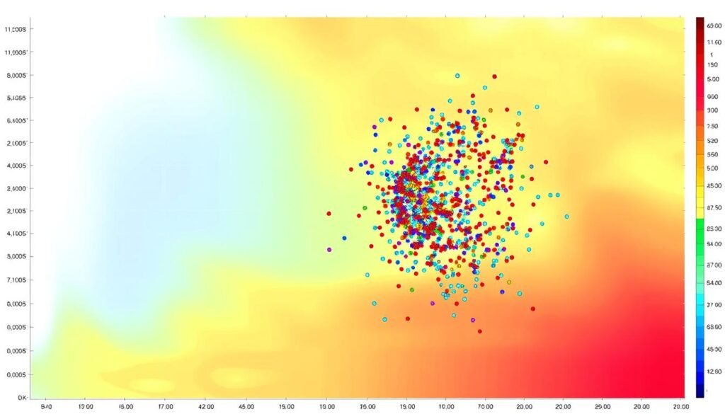
Heat maps are great for showing where data is most or least dense. For example, they can show when a call center is busiest. This helps us plan better.
They use colors to show how busy an area is. This makes it easy to see where things are happening a lot or a little.
Scatter Plots: Showing Relationships Between Variables
Scatter plots are perfect for showing how two things are connected. They can show how marketing spend affects sales, or how happy employees are and how productive they are.
They plot data points on a grid. This lets us see trends, odd points, and how strong the connection is.
Bubble charts are like scatter plots but with a twist. They use size or color for a third variable. This gives us even more insight into our data.
Heat maps and scatter plots are key when we need to see more in our data. They help us tell better stories with our data. And they help us make better choices.
The Power of Dashboard Visualizations
Dashboards are key for companies wanting to use their data well. They mix different charts to show important info. This helps people make smart choices with confidence.
Combining Multiple Chart Types Effectively
Choosing the right charts is crucial for a strong dashboard. Start with the most important data points and choose the visualization that best communicates the story. Use bar charts for comparisons, line charts for trends, and pie charts for parts.
This mix helps tell a clear story without too much info.
Real-Time Data Monitoring with Interactive Dashboards
Dashboards shine when they show data as it happens. Interactive dashboards let users dive into data, finding new insights. This quick access helps leaders act fast on new trends.
Good dashboard design is all about balance. Make sure all charts work well together, telling a strong story. Dashboards unlock data’s power, leading to better decisions.
“The beauty of a dashboard is in its ability to transform complex data into a clear, concise, and visually engaging story.”
Avoiding Common Charting Mistakes
I love making charts to share information. But, it’s important to avoid mistakes that make charts hard to understand. Two big mistakes are making charts too complicated and not using colors and designs well.
Overcomplicating Your Charts
Putting too much info in one chart is a big mistake. It’s tempting to show all data, but it makes charts messy. Pie charts get too busy with more than six points. Line charts should have no more than four lines to stay clear.
Choose the right chart for what you want to show. Scatter plots can handle lots of points without looking messy. By not overloading charts, you make them easy to understand.
Ignoring Color and Design Principles
Good charts need the right colors and design. Not using these well makes charts hard to look at and understand.
Pie charts work best with small amounts of data. Use different colors in combination charts to show different things. Using colors wisely makes charts clearer.
Also, think about fonts, labels, and scaling. These details make charts look good and work better. Clean, simple charts tell a strong story and grab your audience’s attention.
| Chart Type | Best Practices |
|---|---|
| Pie Charts | – Best used with small datasets (up to 6 data points) – Ensure the pieces add up to 100% – Use distinct colors for each slice |
| Line Charts | – Limit to no more than 4 lines to prevent visual clutter – Effective for showing trends over time |
| Scatter Plots | – Can display hundreds of data points without appearing overcrowded – Useful for visualizing relationships between variables |
| Combination Charts | – Use distinct colors to differentiate between variables – Helps in comparing and contrasting different data sets |
By avoiding common mistakes and following best practices, you can make charts that grab attention. These charts will share your insights clearly and inspire action.
Accessibility in Data Visualization
Making data visualizations accessible is key. We want everyone to be able to see and understand our charts. This includes people with visual impairments.
One important thing is color blindness. It affects how people see colors. So, we choose colors that everyone can tell apart.
Ensuring Charts Are Readable for All
It’s not just about colors. We also need clear fonts that are easy to read. And, we should add text descriptions for charts. This helps screen readers and people with assistive tech.
Color Blindness Considerations
There are different types of color blindness. We need to pick colors that are clear for everyone. This makes our charts inclusive data visualization for all.
By following these tips, we make our charts better for everyone. Chart accessibility is important for sharing our data well.
“Accessibility is not just a box to be checked, but a fundamental consideration that should be woven into the very fabric of our data visualization design process.”
Tools for Creating Charts
In today’s world, showing your data is key. You can use spreadsheets or special software to make charts and graphs. Let’s look at some top tools and how they work with your slides.
Popular Charting Software and Platforms
There are many great charting tools out there. Tableau is known for its easy use and cool dashboards. Power BI is a favorite for Microsoft users because of its strong features. Google Data Studio is free and lets you make reports and charts easily.
Integrating Charts with Presentation Tools
Charting tools are great, but they’re even better when you can add them to your slides. Tools like Tableau and Power BI work well with PowerPoint and Google Slides. This keeps your slides fresh and full of important data.
| Charting Software | Key Features | Presentation Integration |
|---|---|---|
| Tableau | Intuitive interface, advanced analytics, interactive dashboards | Microsoft PowerPoint, Google Slides |
| Power BI | Robust data visualization, Microsoft ecosystem integration | Microsoft PowerPoint |
| Google Data Studio | Free, web-based, multi-source data connection | Google Slides |
Using charting software and slides together makes your data stories better. The right tools can make your research and decisions stronger.

Evaluating the Effectiveness of Your Charts
Making good charts is just the start. You also need to get feedback and check how people interact with them. This helps you make your charts better for sharing information and making decisions.
Gathering Feedback from Peers
Get your coworkers to look at your charts. Their thoughts can help you see if your charts are clear. Ask them things like:
- Do the charts clearly show what you want to say?
- Is anything confusing or hard to understand?
- What else could you add to help explain things better?
- Do the charts help with the bigger picture of your presentation or report?
Use this peer feedback to keep making your chart evaluation better. This way, your charts will be as good as they can be.
Analyzing Engagement Metrics
If you share your charts online, use tools to see how people react. Look at things like how long they stay on your charts, if they click on them, and what they say. These can tell you what works best with your audience.
| Metric | Insights |
|---|---|
| Time Spent on Chart | Shows how interested and understanding people are |
| Click-Through Rate | Tells you if people want to learn more |
| User Comments | Gives you direct feedback on how well your charts work |
Look at these engagement metrics to find out how to make your charts even better. This way, you can make sure your charts are really getting your message across.
Best Practices for Data Visualization
Creating charts and graphs that tell your story is key. Keep it simple, focused, and add notes. This way, your data will be clear and easy to understand.
Keeping It Simple and Focused
One big rule is to not clutter your charts. Don’t try to show everything. Focus on the main points you want to share. Chart simplification helps your audience get it fast.
- Get rid of stuff that’s not important.
- Stick to five to seven main points.
- Use clear titles, labels, and legends.
Utilizing Annotations to Enhance Understanding
Annotation techniques help guide your audience. They can point out important details or explain tricky data. This makes your charts more useful.
- Highlight key data points or unusual numbers.
- Add text to explain what the data means.
- Make sure annotations are clear but don’t hide the main chart.
By making your charts simple, focused, and with good notes, you make them useful and fun. Your goal is to help people quickly get the story from your data.
“The greatest value of a picture is when it forces us to notice what we never expected to see.” – John Tukey
Future Trends in Data Visualization
Two big trends are coming in data visualization. AI will make charts better by choosing the right type for the data. This makes creating charts easier and more accurate.
Also, visuals will get more interactive. Users can change views and find new insights. Technologies like AR and VR will make exploring data even more exciting.
These trends aim to help users understand data better. With AI and interactive tools, we can analyze and share data in new ways. This will lead to more innovation and progress in many fields.
FAQ
Why is selecting the right chart type important?
What factors should I consider when choosing a chart type?
How does data visualization play a role in research and decision-making?
What are the different types of charts and their uses?
How do I choose the right chart type for my data and audience?
What are the best practices for creating effective charts?
How can I ensure my charts are accessible to all users?
What are the emerging trends in data visualization?
RELATED POSTS
View all
