Best Infographic Tools for Academic Research Now: Comparison
November 20, 2024 | by Jean Twizeyimana

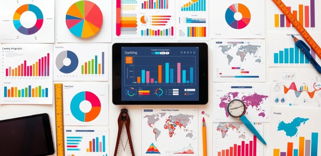
I’m excited to share about the best infographic tools for 2024. In today’s world, showing complex info in a simple way is key. Infographics help make things clear and fun to look at. They’re great for school, research, and teaching.
In this guide, we’ll look at the top infographic tools for schools and research. We’ll talk about their special features, costs, and what they’re good for. This article will help you pick the best tool for your school work.
Key Takeaways
- Infographics are key for showing info clearly in school and research.
- The best tools in 2024 are Visme, Venngage, Canva, Piktochart, Snappa, and Infogram.
- These tools have cool features like custom designs, data views, and team work.
- Prices vary, with free and paid options for all budgets.
- Choosing the right tool can make your school work more engaging.
Introduction to Infographic Tools for Academia
Infographics are key in academic research. They make complex data easy to see and understand. These tools have many features for designers and researchers. They help tell stories with data.
Why Infographics Matter in Academic Research
Infographics turn dry data into fun visuals. They make findings clear and impactful. This helps people understand the main points easily.
They are great for sharing research. They let researchers reach more people in the academic world.
Key Features to Look For in Infographic Tools
- User-friendly interface for easy navigation and design creation
- Extensive library of customizable templates and design elements
- Robust data visualization capabilities, including charts, graphs, and maps
- Collaborative features for team-based projects and real-time updates
- Integration with other academic tools and platforms
- AI-powered features for generating visual content and text
When picking an infographic tool, look for these features. They help make creating infographics easy and fun. This way, researchers can make infographics that grab people’s attention.
Top Infographic Tools Available Today
In the world of research and infographics, many great tools exist. They meet the needs of academics in different ways. Let’s explore some of the best ones:
Canva: Versatile and User-Friendly
Canva is a favorite among many. It has lots of templates and easy features for making infographics. Its drag-and-drop tool is great for both experts and beginners. It helps turn data into beautiful stories.
Piktochart: Ideal for Beginners
Piktochart is loved by over 11 million users. It’s easy to use and has many templates. Dr. Aaron Fischer says it’s helped get funding for projects with its visuals.
Venngage: Great for Collaboration
Venngage is perfect for working together. It has over 7,500 templates and easy design tools. It’s great for team projects in research and education.
Other tools like Visme, Infogram, and Adobe Express also stand out. They offer special features for different needs in research and education.
Comparison of Features: A Quick Overview
Choosing the right infographic tool for your research is important. You need to know about the user interface, customization, and integration. These features affect how easy it is to use and the quality of your visuals. Let’s look at how these features compare in top infographic tools.
User Interface and Experience
The user interface is key to making infographics easy to create. Canva and Venngage are known for being easy to use. They are great for beginners. But, Piktochart might be harder to learn. It has more advanced features for showing research.
Customization Options
Being able to customize your infographics is very important. Excel has many chart types, like donut and radar charts. Infogr.am is good for organizing data. Piktochart has lots of icons and lets you add your own graphics.
Integration Capabilities
Tools that work well with others make creating infographics easier. Venngage is great for working with others. Canva works with Google Analytics, making it easy to add data.

Knowing what each tool does best helps you choose the right one for your research. Look for tools with easy interfaces, lots of customization, and good integration. The right tool can help you show your research in a clear and engaging way.
Pricing Models of Infographic Tools
Choosing the right tool for making infographics is key for academic research. The market has many tools for different budgets and needs. Let’s look at the pricing of top infographic tools and data platforms.
Free vs. Premium Features
Most tools offer a free plan with basic features. This lets users try the tool. But, to use all features, you need to pay for a premium plan. Premium plans cost between $2 and $99 a month, with yearly plans cheaper.
Venngage’s premium starts at $19 a month. Canva’s premium is $12.99 a month. Biteable has plans starting at $99 a month for advanced users or big projects.
Monthly vs. Annual Subscriptions
Infographic tools have both monthly and yearly subscriptions. Yearly plans are cheaper, with discounts of 10% to 20% off monthly plans.
Venngage’s yearly plan is $19 a month, while monthly is $29. Canva’s yearly is $9.99 a month, versus $12.99 monthly.
By looking at features, prices, and subscription types, researchers can find the best tool. This helps make their work more visually appealing.
Educational Discounts and Offers
Many infographic tools give big discounts to students and teachers. This makes it easier for them to make great graphics for school. These discounts help lower the cost, so more people can use these tools.
Special Deals for Students and Educators
Big names like Visme, Infogr.am, and Piktochart have special deals for schools. They offer free or cheap plans for students and teachers. This is a big help for making educational materials.
How to Access Discounts
To get these discounts, you need to show you’re a student or teacher. You might need to give an email from a school. Each tool has its own way to check, so look on their websites.
With these discounts, students and teachers can use top tools without spending a lot. This helps them make great graphics for their studies.
Infographic Templates: What’s on Offer?
Creating eye-catching research visualizations is easier with many infographic templates. Piktochart, Canva, and Venngage have lots of templates for school and research. They help make your work stand out.
Variety of Templates for Academic Use
Piktochart has over 11 million users worldwide. It has many templates for school topics. You can find everything from charts to diagrams. It’s easy to use and has lots of options.
Customizable Templates for Special Topics
Canva has special templates for school projects. You can change them to show your research. Venngage also has many templates for different topics. It’s great for making your research look good.
| Infographic Tool | Variety of Academic Templates | Customization Options |
|---|---|---|
| Piktochart | Extensive library covering statistical, informational, and comparison infographics | Highly customizable with access to thousands of design elements |
| Canva | Dedicated education-focused templates for presentations, reports, and outreach | Easy-to-use interface with robust customization capabilities |
| Venngage | Wide range of templates suitable for diverse academic topics and research | Flexible customization options to tailor templates to specific needs |

Using these infographic tools can make your research look amazing. It makes your work more interesting and impactful.
Ease of Use: Learning Curve Assessment
Creating academic infographics can be easy or hard, depending on the tools you use. Many top academic infographic tools are made for people who aren’t designers. They have simple interfaces and lots of learning resources.
Best Tools for Non-Designers
Canva and Piktochart are great for people who aren’t designers. They have drag-and-drop editors and lots of templates. This makes it easy to make beautiful infographics, even if you don’t know much about design.
Resources for Learning These Tools
- Venngage has step-by-step tutorials and guides. They help you learn how to use the platform and design infographics.
- Easelly sends helpful links and resources when you sign up. They help you think about and make great infographics.
- Many top academic infographic tools have detailed tutorials, FAQs, and user guides. They help you learn as you go.
With the right tools and a bit of practice, anyone can make great infographics. These can really help your academic work and presentations look better.
Best Practices for Creating Academic Infographics
Making great academic infographics needs a smart plan. As someone who loves making info graphics, I think it’s all about picking the right data. Then, use storytelling with data to grab your audience’s attention. Let’s look at how to make infographics that are both fun and informative for your school friends.
Selecting the Right Data
The base of a good infographic is the data you pick. First, find the main points you want to share. Infographics have grown a lot since 2010, showing they’re key in school research. Make sure your data fits your main message and is easy for others to understand.
Design Principles to Engage Your Audience
After picking your data, it’s time to make it look good. Use charts like pie charts and bar graphs to show your data. The biggest text is usually the title, then the subheader, and lastly the body text.
Use cool pictures from places like Pixabay or Unsplash to make your infographic pop. Keep your infographic focused on one topic. Use pictures to show your point, and text to help explain it. Keeping your design the same throughout makes it look better.
By following these tips, you can make infographics that grab people’s attention. They will help share your research in a fun and clear way. This is how you join the trend of using data to tell stories in school.
Sharing and Collaborating on Infographics
Creating great academic infographics is just the start. Sharing and working together on them is key to their success. Top infographic tools have many ways to share and work together.
Exporting Options for Academic Use
Top tools like Canva, Piktochart, and Venngage have many export options. You can save your infographics as PNG, JPEG, or PDF. This makes it easy to use them in presentations, reports, and papers.
Being able to save in high-quality formats is a big plus. It helps keep your visuals clear and sharp.
Collaborative Features for Group Projects
Working together is a must in research. The best infographic tools make it easy. Venngage and Visme let many people edit the same infographic at once.
These tools have features for real-time editing, comments, and keeping track of changes. This makes group projects run smoothly and keeps everyone in sync.
| Feature | Canva | Piktochart | Venngage |
|---|---|---|---|
| Export Options | PNG, JPEG, PDF | PNG, JPEG, PDF | PNG, JPEG, PDF, GIF |
| Collaboration Tools | Limited | Limited | Real-time editing, commenting, version history |
Using the best infographic tools, graphic designers and researchers can share their work easily. They can get feedback and work together to make their research visualization even better.

User Reviews and Feedback on Tools
More and more students and researchers are using scholarly infographics to share their work. User reviews are very helpful in picking the best infographic tools. People who have used these tools share what they like and don’t like about them.
Ratings from Students and Educators
Users love how easy these tools are to use. They also like the many templates available. Tools like Canva and Piktochart are favorites because they are easy to use and have lots of templates for school projects.
Many users also like being able to work together on infographics. They can share and edit together.
Insights from Academic Conferences
At academic conferences, people talk a lot about infographic tools. They say it’s important for infographics to be accurate and look good. Tools like Venngage and Infogram are praised for making complex data easy to understand.
| Infographic Tool | Free Templates | Collaboration Features | Data Visualization Capabilities |
|---|---|---|---|
| Canva | 20 | ✔ | ✔ |
| Piktochart | 9 | ✔ | ✔ |
| Venngage | 6 | ✔ | ✔ |
| Infogram | 6 | ✔ | ✔ |
The table shows some popular infographic tools. It lists free templates and features for working together and showing data. These are key things for students and researchers.
“Infographic tools have become essential for effectively communicating complex research findings to diverse audiences. The visual appeal and interactive nature of these tools can truly enhance engagement and understanding.”
– Dr. Emily Wilkins, Professor of Communication Studies
Future Trends in Infographic Tools
The world of data visualization is changing fast. New tools and features are coming soon. They will change how we show data.
Innovations in Design Technology
Infographic tools are getting smarter. They use AI to help design. This means less work for us.
Tools like Visme’s AI Design Generator help a lot. They suggest designs and colors. They even write text for us.
Upcoming Features to Look Forward To
- More advanced data analysis tools: Soon, infographic platforms will help us find deeper insights. They will turn complex data into cool stories.
- Improved accessibility options: Future tools will be easier for everyone. They will have clear text and colors for all.
- Interactive elements: Infographics will soon be more fun. They will have cool animations and effects.
These new things will help us share our data better. They will make our work more interesting and clear.
| Trend | Example | Impact |
|---|---|---|
| Bold Typography | Visual Capitalist’s infographic on global currencies | Draws attention, establishes hierarchy, and creates visual engagement |
| Playful Layouts | Infographics breaking grid structures for visual intrigue | Disrupts conventional design for a more dynamic and memorable presentation |
| Data Illustrations | Infographics by U.S. Global Investors and Visual Capitalist | Transforms complex data into visually appealing and engaging images |
| Custom Illustrations | Infographics on fashion trends and popular cocktails | Provides a unique and memorable approach to data visualization |
| AI-Generated Infographics | Visme’s AI Design Generator and AI Text Writer | Streamlines the infographic creation process and saves time |
| Accessibility | Infographics with clear typography, high-contrast colors, and alternative text | Ensures inclusivity and makes data visualization accessible to all |
| Interactive Elements | Infographics with dynamic icons, hover effects, animations, and click-through features | Engages viewers and creates an immersive data exploration experience |
As data visualization platforms and visual communication tools get better, we will see cool new things. These will help us share our data in exciting ways.
Conclusion: Choosing the Right Infographic Tool
Infographic tools are everywhere for students and researchers. Canva is easy to use. Piktochart is great for data. Venngage helps you work together.
Summary of Key Comparisons
Choosing the right tool depends on your skills and needs. Venngage and Canva are good for many uses. Mind the Graph is best for science data.
Final Recommendations for Academic Success
Find the tool that fits you best. Try different ones and ask others for their opinions. This will help you make great infographics.
With the right tool, your infographics will impress everyone. They will make your research and presentations stand out.
FAQ
What are the top infographic tools for academic research in 2024?
Why are infographics crucial for academic research?
What key features should I look for in an infographic tool for academic use?
How do the top infographic tools compare in terms of features and capabilities?
What are the pricing models for these infographic tools?
Do these tools offer educational discounts?
What kind of templates do these infographic tools provide for academic use?
How user-friendly are these infographic tools for non-designers?
What are the best practices for creating effective academic infographics?
What are the options for sharing and collaborating on infographics?
What are the user reviews and feedback on these infographic tools?
What are the future trends in infographic tools for academics?
How do I choose the right infographic tool for my academic needs?
RELATED POSTS
View all


