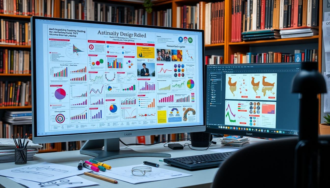
7 Best Scientific Figure Making Software Tools Compared
November 20, 2024 | by Jean Twizeyimana

I know how important scientific figures are for sharing our research. Good graphics make our work clearer and more impactful. Here, I’ll compare seven top tools for making scientific figures. We’ll look at their features, costs, and how easy they are to use.
Key Takeaways
- Discover the top 7 software tools for creating professional-grade scientific figures and illustrations.
- Understand the key features and capabilities of each tool to make an informed decision.
- Learn about the pricing and accessibility options for the different software solutions.
- Gain insights into the strengths and weaknesses of each tool to determine the best fit for your research needs.
- Explore tips and resources to help you get the most out of your chosen figure-making software.
Introduction to Scientific Figure Software
Making great scientific figures is key to sharing your research well. Whether you’re a researcher, scientist, or student, the right graph makers, chart creation software, and scientific image editors are vital. They help show your data in a way that’s both pretty and clear.
Importance of Quality Figures in Science
In science, pictures are very important. They help explain complex ideas and data. Good figures make your research easy to understand quickly. They also make your work look professional and trustworthy.
Key Features to Look for in Software
- Ease of use and intuitive interface for efficient figure creation
- Customization options to tailor the appearance and layout of your figures
- Compatibility with publication standards and file formats
- Advanced charting and visualization capabilities to showcase data in the most effective way
- Integration with other scientific software or data analysis tools
Looking for these key features helps you pick the best scientific image editors and chart creation software. This way, you can make your scientific figures better and share your research more effectively.
“Quality figures are not just aesthetically pleasing – they are essential for effectively communicating complex scientific ideas and findings to your audience.”
1. Adobe Illustrator
Adobe Illustrator is a top choice for scientists and researchers. It’s a powerful tool for making detailed, ready-to-publish scientific images. It gives you full control over your designs.
Overview of Adobe Illustrator for Science
Illustrator works with vectors, which means you can change shapes and lines easily. Your images will stay sharp, no matter the size. It also works with many file types, like SVG and PDF, making it easy to share your work.
Strengths of Using Illustrator for Figures
- Precise control over design elements for clean, professional-looking figures
- Seamless integration with other Adobe Creative Cloud applications for a streamlined workflow
- Ability to easily adjust color schemes, line thicknesses, and other visual attributes
- Versatility in creating high-quality vector graphics, including complex diagrams and illustrations
Adobe Illustrator is a favorite among scientists. It’s known for its strong features and wide use in the field. It’s the best illustration software for researchers and academic drawing programs to make their work stand out.
2. GraphPad Prism
GraphPad Prism is a top pick for easy data visualization. It’s great for life science and biomedical experts. It has many features for making graphs and doing stats.
Introduction to GraphPad Prism
GraphPad Prism helps scientists make high-quality graphs and do stats. It’s easy to use and has lots of tools. It’s popular in biology, medicine, and life sciences.
User-Friendly Features
- Prism lets you make Bubble Plots from raw data. You can use variables for position, color, and size.
- It shows big data sets with extended or truncated violin plots.
- Now, you can see your analysis results in Prism.
- It has new ways to show data trends with Akima splines and better control over splines.
- You can add multiple comparison results to graphs easily. There are many P value summary styles to choose from.
- Making Bubble plots is now faster and easier. You can customize them in real-time with multiple variables data.
- Bar graphs can have values for means, medians, or sample sizes. This highlights important data points.
- Graphs can show individual points (scatter) and bars for mean or median values with error bars. This makes graphs more versatile.
Ideal Use Cases for Researchers
GraphPad Prism is perfect for life science and biomedical researchers. It lets you do many things at once. You can compare data with different tests and models.
It also does survival analysis and Cox proportional hazards regression. This makes it great for analyzing survival data.
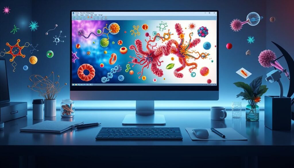
3. BioRender
BioRender is a top choice for scientists. It’s made just for them, with tools that help share their findings. It’s all about making science easy to see and understand.
Expansive Library of Templates and Icons
BioRender has over 30,000 icons and templates. They cover many science areas like biology and immunology. This helps scientists make great pictures and diagrams fast, without needing to be designers.
Effortless Illustration Creation
BioRender is easy to use. It’s perfect for scientists who aren’t designers. They can make great illustrations quickly, focusing on their science.
More than 2.5 million people use BioRender. It’s loved by over 1,500 institutions worldwide. It’s a top pick for making science easy to see and understand.
4. Inkscape
Inkscape is a free and open-source vector graphics editor. It’s a great choice for those who want quality visual aids without spending a lot. It’s perfect for making things look good in publications and presentations.
Advantages of Open-Source Software
Inkscape is open-source, which means it’s free to use. This is great for researchers who don’t want to spend a lot on software. It lets people from all walks of life use powerful tools, no matter their budget.
The Inkscape community is always working on new things. This keeps the software fresh and meets the needs of its users.
Functionalities for Complex Figures
- Inkscape helps make complex scientific figures. It has many tools for working with vector graphics.
- It has special tools like Scale Plots, Autoexporter, and Flattener. These help make plots better, export them easily, and keep things looking the same.
- Tools like Homogenizer, Text Ghoster, and Combine by Color make it even better. They help researchers make their visual aids just right.
Inkscape is a great choice for those looking for a free, open-source option. It’s perfect for making high-quality visual aids for publications without spending a lot.
“Inkscape is an incredibly powerful and flexible tool for creating scientific figures. The open-source nature and active community make it a cost-effective and constantly evolving solution for researchers.”
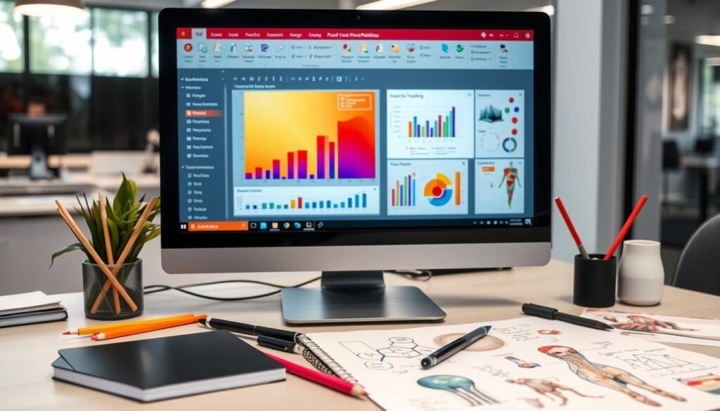
5. Microsoft PowerPoint
Microsoft PowerPoint is not just for presentations. It’s great for making scientific figures too. It has tools that make it easy for researchers to create visual aids for their work.
PowerPoint’s Unexpected Potential
PowerPoint is more than just for slides. It has tools for making charts and illustrations. You can use it to make graphs and diagrams that look professional.
Techniques for Creating Scientific Figures
- Leveraging PowerPoint’s chart creation tools to generate customizable data visualizations
- Utilizing the software’s shape libraries and drawing tools to construct detailed illustrations and diagrams
- Integrating high-quality images and graphics seamlessly into PowerPoint presentations
- Customizing figure elements, such as colors, fonts, and annotations, to align with publication guidelines
- Exporting PowerPoint figures as high-resolution images for inclusion in journal articles or posters
Using PowerPoint can make creating figures easier. It helps scientists make visual aids for publications that show their findings well.
“PowerPoint may be primarily known as a presentation tool, but its versatility extends far beyond slide decks. With its intuitive design features and chart creation capabilities, it has become an invaluable resource for scientists and researchers who need to create high-quality figures for their publications and presentations.”
6. GIMP
GIMP is a free, open-source image editor. It has many tools for making and editing scientific graphics. It’s very popular among researchers and academics because it’s free and works well.
Overview of GIMP for Scientific Graphics
GIMP is a strong raster graphics editor. It can work with many image formats. This makes it great for tasks like changing image contrast and adding scale bars.
It’s also good for preparing micrographs or western blot scans for publication. Its many features and custom options make it a versatile tool for scientific images.
Strengths and Weaknesses
GIMP is open-source, which means it gets better all the time. Thanks to its community, it always gets new updates. But, it has a lot of features, which can make it hard to learn.
Even so, GIMP is still a top choice for many. It’s powerful, flexible, and easy to use. It’s great for making high-quality images for research papers.
“GIMP is a Jack of All Trades, suitable for making full comics alone, while MyPaint is excellent for painting only, Inkscape is noted for vector graphics, and Krita is described as a hybrid of MyPaint and GIMP in the KDE environment, suitable for full comics but might have a learning curve.”
7. CorelDRAW
CorelDRAW is great for making scientific pictures and diagrams. It has many tools and features. It’s easy to use but also has advanced options. This makes it good for both new and experienced users.
Features Beneficial for Scientific Illustrations
CorelDRAW has over 4,000 symbols for technical drawings. It also has 7,000 clipart images and 1,000 high-resolution photos. This gives users lots of visuals for their scientific pictures.
The software has over 1,000 fonts and access to Google Fonts. It also has 500+ templates, including 40+ technical standards. This helps make creating figures faster and easier.
Comparison with Other Software
CorelDRAW is different from Adobe Illustrator and Inkscape. It has more features for scientific and technical drawings. It’s easy to use and has powerful tools, making it great for researchers.
It’s better than Microsoft PowerPoint for making detailed illustrations. CorelDRAW focuses on technical design and follows industry standards. This ensures researchers can make high-quality illustrations for their work.
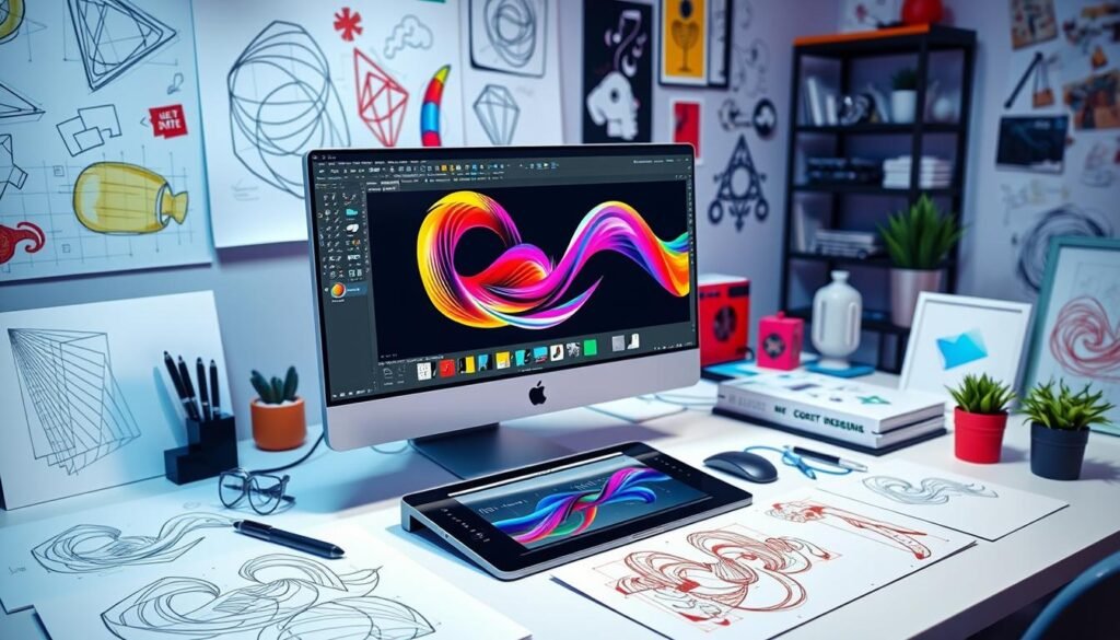
CorelDRAW is a top choice for researchers and scientists. It has many features, resources, and is easy to use. It helps bring scientific ideas to life with clear and detailed figures and diagrams.
Pricing and Accessibility of Tools
Researchers have many choices for making scientific figures. They can pick from free or paid tools. The choice depends on your budget, how often you use it, and your project’s needs.
Free vs. Paid Software Options
For those with less money or who don’t use it often, free tools like GIMP and Inkscape are great. They have lots of features and are supported by many users. This makes them good for making high-quality figures.
Paid tools like Adobe Illustrator, GraphPad Prism, and BioRender have more features. They also have better support and workflows. These are good for those who make complex figures often.
Subscription Models and One-Time Purchases
When looking at paid tools, think about subscriptions versus one-time buys. Subscriptions, like BioRender, offer updates and flexibility. One-time buys, like CorelDRAW, are better for those with a set budget.
Choosing the right tool depends on your needs, budget, and how often you use it. Look at all options and their prices to find the best one for you.
Final Thoughts: Choosing the Right Software
Choosing the right software for making scientific figures is very important. It depends on your research needs, skills, and budget. You should think about how easy it is to use, its features, and if it fits your field.
Tailoring Software to Your Specific Needs
Not all software is the same for making scientific figures. Some are great for complex, ready-to-publish visuals. Others are simpler and easier to use.
Think about what you need. Do you want advanced illustrations, easy data integration, or something you already know how to use? Choosing the right software will help you make the best figures.
Additional Resources and Tutorials
Where to Find Help and Learning Materials
Many tools for making scientific images have lots of tutorials and guides. They also have forums for users to talk and share tips. These resources help you learn new things, fix problems, and keep up with new updates.
When you try a new tool, look at the official help, videos, and user groups. They offer support and help you learn more.
Community and Support Channels
There are also many online groups for scientific image making. You can find them on social media, forums, and in professional groups. These places let you meet other people who make images and designs.
They can share ideas, tips, and help you solve problems. Joining these groups can help you learn, get ideas, and fix any issues you face.
FAQ
What are the key features to consider when choosing scientific figure software?
How does Adobe Illustrator compare to other options for scientific illustration?
What are the benefits of using GraphPad Prism for scientific graphing?
How does BioRender stand out as a tool for life science illustrations?
What are the advantages of using the open-source software Inkscape for scientific figures?
How can Microsoft PowerPoint be used for creating scientific figures?
What are the strengths and weaknesses of GIMP for scientific graphics?
How does CorelDRAW compare to other software options for scientific illustrations?
What factors should I consider when choosing between free and paid scientific figure software?
What resources are available for learning and troubleshooting scientific figure software?
RELATED POSTS
View all
