What is Data Visualization? A Guide for Academic Researchers
November 17, 2024 | by Jean Twizeyimana

Data visualization is when we show data in pictures. It can be graphs, maps, or charts. In school, it helps us see and share data.
Researchers use it to find patterns in their data. They also use it to show their findings to others. A famous example is Anscombe’s Quartet. It shows how different data can look when shown in pictures.
Key Takeaways
- Data visualization is a powerful tool for academic researchers to explore and communicate complex data patterns.
- Visualizations can help researchers uncover insights that may not be readily apparent in raw data or text.
- Data visualization can be used for both exploratory analysis and presenting research findings to audiences.
- Effective data visualization requires consideration of design principles, audience needs, and the appropriate choice of visualization type.
- There are numerous free and paid tools available for creating data visualizations, each with their own strengths and capabilities.
Understanding Data Visualization in Research
Data visualization turns complex research into easy-to-understand stories. It makes data into pictures that show patterns and insights. This is shown in Anscombe’s Quartet, where four datasets look very different when graphed.
Definition and Importance
Data visualization makes information into pictures like charts and graphs. It helps researchers share their findings clearly. This way, people can understand complex ideas quickly.
Historical Context
Data visualization has changed a lot over time. It started with simple drawings and now uses advanced technology. This change has made it easier for researchers to show their work in new ways.
| Key Milestones in Data Visualization History | Impact on Research |
|---|---|
| Hand-drawn charts and graphs | Allowed researchers to communicate findings visually, but limited by manual creation and lack of precision. |
| Spreadsheet software (e.g., Microsoft Excel) | Transformed data into tables, bar charts, and pie charts, making visualization more accessible to researchers. |
| Advances in computer graphics and software | Enabled more sophisticated and interactive data visualizations, including dynamic displays and customizable visuals. |
| Integration with machine learning and AI | Unlocked new possibilities for automated data analysis and intelligent data visualization tools. |
As data visualization gets better, researchers use it more. They find new insights and share their work in exciting ways.
Key Principles of Data Visualization
Data visualization in research follows important rules. These rules make sure the visuals are clear, simple, accurate, and honest. They help share research findings well while keeping science strict.
Clarity and Simplicity
Clarity means the visuals are easy to get. Simplicity means not too much stuff. Too many details, like long tables or hard charts, make it hard to understand. We should focus on the main points with smart design.
Accuracy and Integrity
Being accurate and honest is key in research. Cleveland’s study showed 30% of Science journal graphs had errors. Keeping data true builds trust with the audience.
| Visualization Type | Best Use |
|---|---|
| Pie Charts | Comparisons between a relatively low number of categories |
| Bar Charts | Precise comparisons between categories and showing negative and positive values |
| Scatter Charts | Displaying correlation and clustering, especially with large datasets |
| Line Charts | Emphasizing trends over time |
| Bubble Charts | Showcasing distribution or relationships in large datasets |
| Area Charts | Facilitating the comparison of data volumes |
Following these rules helps make visuals that look good and share research well. This way, researchers can talk to many different people in the academic world.
Types of Data Visualization
Data visualization is key in academic research. It helps share complex info clearly. We have charts, graphs, infographics, and heat maps for different needs. Let’s explore how these tools can make your research shine.
Charts and Graphs
Charts and graphs show trends and relationships. Line charts show how data changes over time. Bar graphs compare values in different groups. Scatter plots find patterns between two things.
Infographics
Infographics mix text and pictures to share info easily. They’re great for sharing research with many people. They use stats, images, and short texts to get the main points across.
Heat Maps
Heat maps show data density with colors. They’re perfect for showing where data is most or least dense. This is great for seeing trends in maps or charts.
Each visualization has its own use. Choose the right one for your data and story. The right tools can make your research stand out and share your findings well.
| Visualization Type | Description | Suitable Data | Examples |
|---|---|---|---|
| Line Charts | Displays data changes over time | Time-series data | Trends in research funding, population growth |
| Bar Graphs | Compares values across different categories | Categorical data | Academic achievement by subject, budget allocation |
| Scatter Plots | Visualizes the relationship between two variables | Bivariate data | Correlation between income and education level |
| Infographics | Combines text and visuals to present complex information | Diverse data types | Research methodology, summary of key findings |
| Heat Maps | Displays data density or intensity across a two-dimensional space | Spatial data | Geographical distribution of research participants |
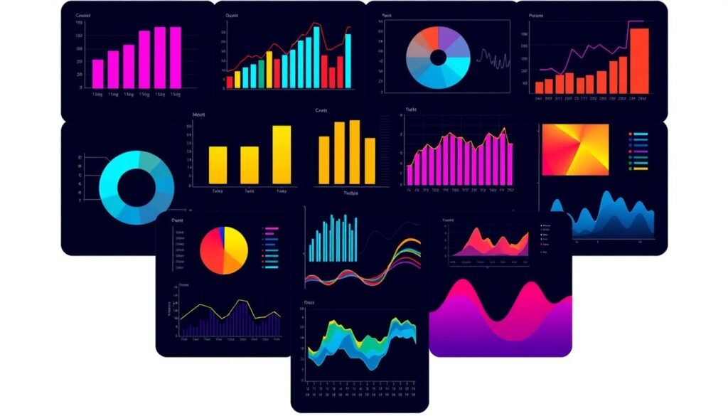
“The best data visualization is the one that communicates the story of your research most effectively.” – Edward Tufte, Data Visualization Expert
Choosing the Right Visualization Tool
Finding the right tool to show your research is key. You have many choices, each with its own strengths. From R and Python to Tableau, picking the right one can be hard. But, knowing what to look for can help you find the best tool for your research.
Popular Tools Overview
Here are some top tools for showing research:
- R and ggplot2 offer many charts and stats.
- Python libraries like Matplotlib and Seaborn are flexible and strong.
- Tableau is great for interactive dashboards and stories.
- D3.js is perfect for web-based, interactive visuals.
Factors to Consider
Think about your data, what you want to show, and your skills. Also, who will see your research matters. Some tools are easier for non-tech people to use.
Trialing Different Options
Try out different tools to see which fits your research best. Many offer free trials. This way, you can see what each tool can do before deciding.
“The right data visualization tool can make all the difference in effectively communicating your research findings to your target audience.”
Best Practices for Data Presentation
It’s key for researchers to show their findings well. Edward Tufte says to do it right, effectively, ethically, and efficiently. By following best practices, they can make complex info easy to understand.
Choosing Appropriate Color Schemes
Choosing colors is very important. Pick colors that look good and are easy for everyone to see. Use colors that are easy for people with color blindness to see too.
Simplifying Complex Data
It’s hard to make complex data simple. But, it’s important to show the main points clearly. Use charts and graphs that are easy to understand.
Labeling and Annotation Tips
Good labels and notes help people understand data. Use clear titles and notes to explain what you’re showing. Make sure everything is easy to read.
“The greatest value of a picture is when it forces us to notice what we never expected to see.” – John Tukey, Statistician
By following these tips, researchers can make their data easy to see and understand. This helps them share their findings with many people.
Understanding Your Audience
When you use data visualization in research, knowing your audience is key. People like researchers, policymakers, students, or the public have different knowledge levels. Making visuals that meet these needs helps share information well.
Identifying Different Audience Types
Researchers talk to many people, each with their own background and needs. Here are some important groups:
- Fellow researchers: They like detailed, technical visuals because they know a lot about the topic.
- Policymakers: They want simple, clear visuals that show important points for making decisions.
- Students: Visuals for learning should be easy to understand but not too simple.
- General public: Visuals for everyone should be easy to get, with no hard words and a clear message.
Tailoring Visuals for Diverse Needs
Changing how complex or detailed your visuals are is important. This means:
- Changing how detailed it is: For experts, you can use lots of details. For others, keep it simple.
- Picking the right visuals: Choose charts or graphs based on what your audience can understand.
- Making it easy to see: Use clear labels, short explanations, and good colors to help everyone.
By making visuals that fit your audience, you can share your research better. This helps people make better choices and have a bigger impact.

Common Mistakes to Avoid
Academic researchers need to watch out for common mistakes. These can make their work less clear and less impactful. Two big mistakes are making visuals too complicated and not understanding the data’s context.
Overcomplicating Visuals
Data visualization aims to make complex info simple. But, it’s easy to add too much to a graphic. This can confuse people with bad color choices, too much data, and wrong 3D graphics.
The goal is to show only the most important info. This way, people can easily see the main points without getting lost.
Ignoring Data Context
It’s also key to give the right context for the data. Leaving out important info, cutting off scales, and changing text in a way that’s not fair can confuse people. It can also make them lose trust in the research.
Researchers must be careful not to show just any connection between things. They need to explain the data’s limits and any possible biases. This helps people understand and trust the research.
By avoiding these mistakes, researchers can share their findings clearly. They can make data visualizations that are both beautiful and easy to understand. This skill is very important for making a big impact in research.
Enhancing Your Visuals with Interactivity
Data visualization is key in academic research. It helps share complex info clearly. Interactive visuals add big benefits to your research talks and papers.
Benefits of Interactive Visuals
Interactive data visuals let users dive into the data. They find patterns and links not seen in still images. Zoom, filters, and hover info keep the audience hooked and learning more.
Interactive visuals also make talks more fun and lasting. They let the audience play with the data. This makes learning more fun and boosts your research’s impact.
Tools for Creating Interactive Content
- Plotly: A versatile data visualization tool that enables the creation of interactive charts, graphs, and dashboards.
- D3.js: A JavaScript library that allows for the creation of highly customizable and interactive data visualizations.
- Tableau: A powerful data analysis and visualization platform that offers a wide range of interactive features, including filtering, zooming, and drill-down capabilities.
These tools help make your content look good and interactive. They’re great for online stuff. Using visual analytics and information visualization tools makes your research more engaging and clear.
Case Studies of Effective Data Visualization
Looking at how data visualization works in research can teach us a lot. These examples show new ways to share complex data in fun and useful ways.
Highlighting Successful Academic Research Projects
Interactive dashboards are a great example in epidemiology. They help track diseases and share findings with everyone. These tools let users dive into the data and see trends clearly.
Network visualizations are also cool in social science. They show how people connect and share information. These pictures help us see the big picture of social networks.
Learning From Other Industries
Researchers can learn from other fields too. Prominent news outlets use cool infographics and stories to share data. They can make their research more interesting and easy to understand.
The business analytics world also uses advanced tools to understand big data. Researchers can use these ideas to make their findings clearer and more exciting.

“Effective data visualization is not just about creating aesthetically pleasing charts and graphs; it’s about translating complex information into a format that is intuitive, engaging, and actionable for the target audience.”
Future Trends in Data Visualization
Technology is changing fast, and data visualization is no exception. New tech like virtual and augmented reality, and machine learning, will change how we see and share data. These changes will help researchers find and share their data in new ways.
Advances in Technology
Virtual and augmented reality are changing visual analytics. They make data come alive in 3D. This lets researchers see and touch data in new ways, getting deeper insights.
Artificial intelligence and machine learning also help. They find patterns and oddities in big data. This makes data visualizations more detailed and accurate.
Integration with Machine Learning
Machine learning and data exploration methods are changing data visualization. AI algorithms can find trends and insights in huge data sets. This helps researchers make visualizations that fit what each person needs.
These tech advances and the mix of data visualization with machine learning will change how researchers work. They will use immersive tech and smart data analysis. This will make data visualization exciting and groundbreaking, helping researchers discover and share more.
“The future of data visualization lies in its ability to seamlessly integrate with emerging technologies, empowering researchers to explore and communicate their findings in captivating and insightful ways.”
Resources for Academic Researchers
As an academic researcher, learning to show your data well is very important. There are many ways to get better at this. You can find books, online courses, and workshops to help you.
Recommended Books and Articles
“The Visual Display of Quantitative Information” by Edward Tufte is a great start. It teaches you how to make clear and interesting visuals. “Storytelling with Data” by Cole Nussbaumer Knaflic also helps. It shows how to make data stories that grab people’s attention.
Online Courses and Workshops
- Coursera and edX have lots of courses on data visualization for academic research and information visualization tools. They cover everything from simple charts to advanced methods.
- Many schools and groups offer workshops and webinars. These let you practice your skills in a hands-on way.
- Tableau Public and RAW are great for making easy-to-understand visuals. They have lots of tutorials to help you start.
By checking out these resources, you can keep up with new trends in data visualization for academic research. This will help you make visuals that grab and teach your audience.
“Effective data visualization is not just about making pretty pictures—it’s about communicating insights, telling stories, and ultimately, driving better decisions.” – Cole Nussbaumer Knaflic
Conclusion: The Importance of Data Visualization
Data visualization is key for academic researchers. It helps share complex findings in a clear way. This makes research more accessible and impactful.
Using clear, accurate, and audience-focused designs is crucial. These visuals engage and teach the viewer.
Recap of Key Points
This article showed why data visualization is important. It’s about choosing the right visuals and following best practices. It also helps show patterns and trends in data.
Encouragement for Practical Application
Data visualization is getting more important as data grows. I urge you to use these skills in your research. This will make your work more impactful and help others understand it better.
FAQ
What is data visualization, and why is it important for academic research?
What are the key principles of effective data visualization in academic research?
What are some common types of data visualizations used in academic research?
How can researchers choose the right visualization tool for their needs?
What are some best practices for presenting data effectively in academic research?
What are some common mistakes to avoid in academic data visualization?
How can interactive visualizations enhance data presentation in academic research?
What resources are available for academic researchers to improve their data visualization skills?
RELATED POSTS
View all
