Free Data Visualization Tools for Students and Researchers
November 19, 2024 | by Jean Twizeyimana
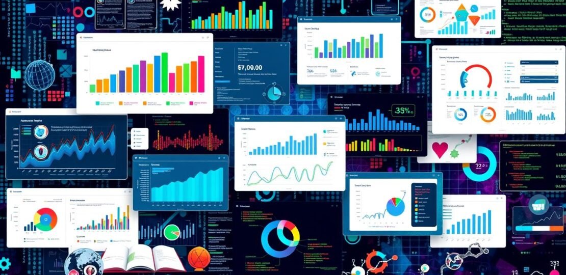
As a student or researcher, I know how key it is to share complex data well. Data visualization turns numbers into clear, interesting graphics. Luckily, many free tools are out there to help with my studies and projects.
In this article, I’ll look at many free tools for making data look good. These tools range from online apps to desktop software. They suit all skill levels and needs, helping students and researchers alike. Using these free tools, I can make my work more impactful and reach my audience better.
Key Takeaways
- Discover a range of free data visualization tools suitable for students and researchers
- Explore web-based and desktop software options that cater to different skill levels and research needs
- Learn how to effectively communicate complex data through visually engaging graphics
- Enhance the impact of your academic work and research projects with free visualization tools
- Gain access to cost-effective and accessible resources to elevate your data presentation
Introduction to Data Visualization Tools
Data visualization turns complex info into simple pictures. It’s key in research to share findings well. The right tools make your data easy to see and understand.
What is Data Visualization?
Data visualization shows info through pictures. It uses charts and graphs to make data easy to get. This is great for research, where big data needs to be clear.
Importance of Visualization in Research
Data visualization is very important in research. Good visuals help find patterns and share findings. They make presentations interesting and clear.
Using data visualization has many benefits:
- It makes data easier to understand
- It helps share complex info well
- It keeps people interested and informed
- It finds trends and special points in data
Learning data visualization can change how you share your research. It makes your work stand out and be remembered.
“Visualization gives you answers to questions you didn’t know you had.” – Ben Shneiderman, Professor of Computer Science, University of Maryland
Benefits of Using Free Tools
Free tools for academic and scientific projects are great for students and researchers. They are affordable and easy to use. Tools like Tableau Public and Google Data Studio let you make cool visuals without spending money.
Cost-Effectiveness for Students
Students often have small budgets. Free data visualization tools help a lot. They have many features, just like the paid versions. For example, Tableau Public lets you share your work for free.
This means students can practice their skills without spending a lot.
Accessibility for Researchers
Free tools are also great for researchers. They make it easier to work with data. Tools like Google Data Studio help you make different views of your data.
Other tools, like Datawrapper and Chartbuilder, have free plans. They meet the needs of many researchers.

These free tools help students and researchers show their work well. They make complex data easier to understand. This way, everyone can share and learn from each other’s discoveries.
Popular Free Data Visualization Tools
As a student or researcher, finding free data tools can change your game. These tools help turn data into cool, useful pictures. They let you find new insights and share your findings well. Let’s look at some free tools you can use.
Tableau Public
Tableau Public is a great tool for beginners and experts. It’s easy to use and lets you connect to many data sources. You can make cool dashboards and share them online.
Google Data Studio
Google Data Studio, now Looker Studio, is free and works well with Google tools. It lets you make many types of pictures and connect to lots of data sources. It’s perfect for interactive data exploration.
Infogram
Infogram is mostly paid but has a free version. You can make up to 10 projects with it. It’s great for making data-driven stories that look good online.
Other free tools include Openheatmap for maps, Leaflet for interactive maps, and Datawrapper for charts. These tools help you explore data and share your findings well.
“The ability to visualize data is a powerful tool that can transform the way we understand and communicate complex information.”
When trying these free tools, think about how easy they are to use. Also, check if they work with your data and if you can make them interactive. Using these tools can help you see things in new ways and share your work effectively.
Getting Started with Visualization
Starting your data storytelling journey is exciting. It’s important to pick the right tools for you. For beginners, Datawrapper is great because it’s easy to use. It helps you make nice charts and graphs.
As you get better, you might want to try Tableau Public or D3. These tools let you make more complex and custom visuals.
Choosing the Right Tool for Your Needs
Choosing the right tool for data storytelling with visuals depends on a few things. Think about the data you have, what you want to show, and how good you are at using tools. Start with something easy to use that lets you play with different charts.
When you get better, you can try more advanced research visualization tools. These tools let you do more and customize your visuals.
Basic Steps to Create Visuals
- Prepare your data: Make sure your data is clean and ready to use.
- Choose a visualization type: Pick the best chart or map for your data and story.
- Customize the output: Change colors, labels, and more to make your visual better.
- Refine and iterate: Keep trying and changing things until you’re happy with it.
Good data visualization is not just about knowing how to use tools. It’s also about knowing your audience and what you want to say. By practicing and trying new things, you’ll get better at using data storytelling with visuals tools.

Advanced Features for Enthusiasts
Free data visualization tools have cool advanced features. They let you customize and connect with other software. This helps you make amazing visuals and work with data better.
Customization Options
Tools like D3 and Processing need coding skills. But they let you change your visuals a lot. You can pick colors and add animations to match your brand.
Integration with Other Software
Many free tools work with data analysis software and APIs. This means you can use them with other interactive data exploration tools. Tools like Tableau and Google Data Studio help you update data and add visuals to reports.
“In 2024, due to advances in generative AI, creating eye-catching visuals through data visualization is easier than ever before.”
Exploring data visualization further is exciting. Being able to customize and connect tools changes the game. It lets you make data stories that grab people’s attention.
Case Studies: Success Stories
Free tools like Tableau Public and Infogram have helped many. They turn hard data into cool, interactive dashboards. This makes research easy to understand and share.
How Researchers Used These Tools
Researchers have made their studies come alive with these tools. A team at a top university used Tableau Public. They made a dashboard that showed how different things affect climate change.
This helped people and leaders understand their findings better.
Student Projects with Visual Data
- Students have also used these tools for their projects. A group of engineering students made an infographic with Infogram. It showed how their product saves energy.
- A linguistics student used Voyant Tools to find interesting patterns in old books. They showed their findings in cool, moving pictures.
These stories show how free tools help in school and research. They make hard ideas easy to get and share. They also help people care more about science.
| Organization | Tool Used | Impact |
|---|---|---|
| BNP Paribas Personal Finance | Neo4j | Reduced fraud by 20% |
| Dun & Bradstreet | Neo4j | Improved complex company ownership checks, reducing time from days to milliseconds |
| Intuit | Neo4j | Secured network infrastructure and data of 100 million customers |
| Transport for London | Neo4j | Aims to cut congestion by 10% and save $750 million annually with a digital twin |

“Data storytelling has expanded beyond journalism into various sectors like brands, NGOs, universities, and more, demonstrating the power of data visualization.”
Tips for Effective Data Visualization
Making good data visualizations needs a good eye for design and knowing how to tell stories with data. There are key tips for making visuals that grab your audience’s attention.
Best Practices for Design
First, pick the right chart type for your data. Pie charts show proportions well. Bar charts are great for comparing things. Line charts show trends, and scatter plots show how things relate.
Keep your visuals simple. Don’t make them too busy or add too many colors. Also, make sure everyone can see your data by using clear colors and text.
Common Mistakes to Avoid
Don’t make your visuals too complicated. Too much info or wrong scales can mess up your message. Make sure your data is clean and right before you start.
Follow these tips and avoid common mistakes. This way, you can make data visuals that really grab people’s attention and share your research well.
“The greatest value of a picture is when it forces us to notice what we never expected to see.”
– John Tukey, Statistician
Resources and Tutorials
Are you into research data visualization? You’ll find lots of free resources and tutorials to learn. These tools and communities can make your work better, no matter if you’re new or experienced.
Explore Learning Materials from Visualization Tool Providers
Tableau has lots of video tutorials and training to help you. Processing also has detailed guides and examples from the community. These resources can help you learn and grow.
Engage with Online Communities and Forums
Joining online groups is great for learning about research data visualization and open-source visualization. Sites like Stack Overflow and Visualizing Data blog offer lots of help. You can find answers and new ideas to try.
| Resource Type | Number Recommended |
|---|---|
| Blogs for data visualization resources | 15 |
| Newsletters related to data visualization | 8 |
| Tool-specific blogs mentioned | 5 |
| Practice projects and platforms | 5 |
| Examples of data visualization resources | 13 |
| Data visualization tools recommended | 9 |
With so many resources, you can explore research data visualization and open-source visualization deeply. Whether you’re starting or already know a lot, there’s help and support for you.
Conclusion and Future Trends
Free data visualization tools are changing fast. New tech and a need for better data sharing are driving this change. The future looks bright, with more interactive and immersive data experiences coming.
These will use artificial intelligence (AI) and augmented reality (AR). This is exciting for everyone who works with data.
Evolving Needs in Data Visualization
What we need from data visualization is changing too. We want more personalized and interactive tools. We also need better storytelling and predictive analytics.
Tools that work on all devices and are easy to use on phones will become more important. This is because we all use different ways to access and analyze data.
Encouragement to Explore These Tools
I want you to keep trying out these free data visualization tools. They can make your data presentations better. They can also help you discover new things in your field.
By using these tools, you can be at the leading edge of data discovery. This is important for making good decisions and finding new ideas.
FAQ
What is data visualization?
Why is data visualization important for students and researchers?
What are the benefits of using free data visualization tools?
What are some popular free data visualization tools?
How do I select the appropriate data visualization tool for my needs?
What advanced features do these data visualization tools offer?
Can you provide examples of how students and researchers have used these free data visualization tools?
What are some best practices and common mistakes to avoid in data visualization?
Where can I find resources and tutorials to learn more about data visualization?
What are the future trends in the field of data visualization?
RELATED POSTS
View all
How to Create Effective Research Visualizations: Complete Guide
November 17, 2024 | by Jean Twizeyimana

The Best AI Tools in Academic Writing and Cite More Effectively Now
November 12, 2024 | by Jean Twizeyimana

The Best AI Plagiarism Checker Tools in Academia
October 16, 2024 | by Jean Twizeyimana