Making Research Dashboards: Beginner’s Guide
November 19, 2024 | by Jean Twizeyimana
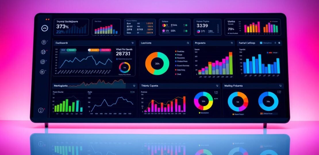
In today’s fast-paced world, research dashboards are key for sharing information. They help us see data fast and clear. This guide will teach you to make dashboards that grab attention, make data easy to understand, and uncover important insights.
Key Takeaways
- Research dashboards are powerful tools for data visualization and communication.
- Effective dashboards prioritize clarity, simplicity, and audience understanding.
- Data ink ratio, rounding, and efficient visualization are essential design principles.
- Grouping related metrics and providing context enhance dashboard readability.
- Ongoing user feedback and iteration are keys to successful dashboard development.
What is a Research Dashboard?
A research dashboard shows important data in a clear way. It helps people see research findings or project status fast. It combines data from different places into one place. This makes it easy to see trends and make smart choices.
Definition and Purpose
A research dashboard is a tool that makes hard data easy to understand. It shows important numbers and insights in a fun way. This helps users track progress and make choices based on data.
Key Features of Research Dashboards
- Interactive elements: Research dashboards have cool features like filters and charts. They let users dive deep into data and find new insights.
- Data visualization tools: Dashboards use charts and graphs to show data in a neat way. This makes it easy to understand.
- Comprehensive data presentation: They bring together data from many places. This gives a full view of research or project status in one spot.
Research dashboards have special features that help people understand complex data. They spot trends and make better choices. This helps in research and business success.
Why You Need a Research Dashboard
Research dashboards are amazing for researchers and analysts. They give a clear view of important data. This makes your research better in many ways.
Benefits for Researchers and Analysts
These dashboards make it easy to see trends and insights. You can move through complex data quickly. This helps you make fast, smart choices.
They also help teams work together. Everyone can share findings and talk about what they mean. This makes sure everyone is on the same page.
Enhancing Data Visualization
Research dashboards turn data into cool pictures. They use special data presentation tricks to make data easy to understand. This makes talking about data better and more fun.
Using a research dashboard can change your work. It makes data easier to work with, helps teams work together, and makes data look good. This leads to better research and smarter choices.
Key Components of an Effective Dashboard
Making a good research dashboard takes careful thought. It needs three main things: good data sources, the right tools to show data, and an easy-to-use design. These parts work together to turn data into useful information. This helps leaders make better choices and helps the company do well.
Data Sources
The base of a great dashboard is its data. It must come from reliable, current, and trustworthy places. This data should match the dashboard’s goals and what it needs to show. Good data makes sure the dashboard is a true source of information. This helps in making choices based on data and makes the dashboard more useful.
Visualization Tools
Choosing the right tools to show data is very important. Researchers need to pick charts and graphs that show the data well. These tools should fit what the dashboard’s users need. It’s important to find a balance between being simple and showing a lot of information.
User Interface Design
A good design makes the dashboard easy to use. The layout, how to move around, and interactive parts should be simple. Thinking about what users like, how devices work, and making it accessible helps a lot. This makes users want to use the dashboard more and make better choices.

By focusing on strong data, good tools to show data, and a design that users like, researchers can make dashboards that really help. They turn data into useful information that helps the company succeed.
Steps to Create a Research Dashboard
Creating a good research dashboard takes steps. First, plan it by knowing what your users need and what you want to achieve. Think about what questions you want to answer and what insights you seek. This helps keep your dashboard useful and valuable.
Planning and Understanding Needs
Begin by learning about your audience and their data needs. Talk to people like researchers and analysts to see what they need. Working together helps make a dashboard that really helps your users.
Data Collection and Preparation
After knowing your dashboard’s purpose, gather and get your data ready. Make sure it’s clean, right, and fits your research goals. You might need to mix data from places like data stores or use tools like Dremio or Apache Drill.
Choosing the Right Tools
Now, pick the best tools to build your dashboard. Look at how easy they are to use, how well they work together, and if they can grow. Good data visualization and business intelligence tools make dashboards easy to use and look good.
Creating a great research dashboard is all about careful planning, getting your data right, and choosing the best tools. Follow these steps to make a dashboard that helps your users and gives them useful insights.
Selecting the Right Tools for Dashboard Creation
Choosing the right tools for research dashboards is key. There are many options, from top platforms to free ones. Pick the one that fits your needs and skills.
Popular Software Options
Here are some top tools for dashboards:
- Tableau – Known for great visuals, Tableau makes exploring data easy. It connects well with many data sources.
- Power BI – Microsoft’s tool, Power BI, uses AI for better data interaction. It helps create insightful reports.
- Klipfolio – Klipfolio connects over 400 data sources. This includes Google Analytics and Salesforce, for detailed dashboards.
- Grafana – An open-source tool, Grafana works with many data sources. This includes InfluxDB, Prometheus, and Elasticsearch.
- DOMO – DOMO connects with over 1,000 data sources. It lets users see data from different places in one place.
Choosing a tool depends on many things. Like how well it connects to data, its visuals, how easy it is to use, and your budget. Open-source tools like Grafana are flexible but need more work. Tools like Tableau and Power BI offer strong support and features.
The best tool for you depends on your research needs and data complexity. Also, consider your team’s technical skills. By looking at all options, you can make sure your dashboards are clear and useful.
Data Visualization Principles
Good data presentation and storytelling need basic rules. Being clear and simple is key when making dashboards. The right charts help your audience understand your message.
Importance of Clarity and Simplicity
Data visualization aims to show important insights fast. Too many fancy things can confuse. Keep it simple and clear for everyone to get it.
Choosing the Right Chart Types
- Bar charts are great for comparing things.
- Line charts show trends over time.
- Scatter plots show how two things relate.
- Pie charts are good for showing parts of a whole.
- Histograms show how data spreads out.
Using colors wisely can make things clearer. Stick to 2–4 colors to not overwhelm. Think about how colors look to everyone, including those with color blindness.
| Chart Type | Best Use |
|---|---|
| Bar Chart | Comparing quantities across different categories |
| Line Chart | Showing trends over time |
| Scatter Plot | Displaying the relationship between two variables |
| Pie Chart | Showing parts of a whole |
| Histogram | Illustrating the distribution of a dataset |
By using these tips, you can make dashboards that share insights well. This will keep your audience interested.

Designing an Interactive Dashboard
Interactive dashboards are key in data-driven decisions. They let users dive deep into data, finding patterns and trends. This turns data into useful insights, helping organizations make better choices.
Importance of User Interaction
Good dashboards engage users and let them explore data deeply. Features like drill-down, filters, and hover-over info help users see more. Interactive reporting and visual analytics help users understand data better.
Techniques for Engagement
- Drill-down Functionality: Users can go from big pictures to small details, exploring what interests them.
- Filtering and Sorting: Users can filter and sort data to fit their needs.
- Hover-over Tooltips: Tooltips give extra info when users hover over dashboard elements.
- Dynamic Visualizations: Interactive charts help users explore data in new ways.
Using interactive reporting and visual analytics makes dashboards more engaging. This turns data into insights that help make smart decisions.
“The true value of a dashboard lies in its ability to enable users to ask and answer their own questions, rather than simply presenting pre-defined information.”
| Dashboard Type | Key Features | Target Users |
|---|---|---|
| Strategic | High-level KPIs, long-term trends | Executives, C-suite |
| Operational | Heatmaps, activity tracking | Operations managers |
| Tactical | Key data points, daily activity | Middle managers |
| Analytical | Interactive data exploration | Analysts, researchers |
Best Practices for Dashboard Layout
Creating a good research dashboard needs careful planning. Where you put your most important data matters a lot. It helps users find what they need fast.
Organizing Information Effectively
It’s important to arrange your dashboard in a way that makes sense. Put your top key performance indicators in the top left corner. This is where users look first.
Group similar data together. This makes your dashboard easy to read. It helps users see what’s important.
Make sure your dashboard looks balanced. Use the same size and placement for things. Don’t make it too busy. This helps users focus on what’s important.
Prioritizing Key Metrics
Choose the key performance indicators (KPIs) you want to show. Pick the ones that are most important for your goals. Don’t show too many, or it gets confusing.
Think about who will use the dashboard. What do they need to see? Pick metrics that help them make good decisions.
“Effective dashboard design is not just about aesthetics; it’s about creating a user-friendly interface that seamlessly combines data, visualizations, and insights to drive informed decision-making.”
By following these tips, you can make a dashboard that looks good and works well. It helps users understand data and make smart choices.
Testing Your Research Dashboard
Creating a good research dashboard takes time and testing. As someone who works with data, I know it’s important to listen to what users say. Their feedback helps make the dashboard better and easier to use.
Gathering User Feedback
To make a dashboard that people like, you need to see how they use it. Watch how users move around the dashboard. Note what they like and what they find hard. It’s helpful to test it with a few people who are like your users.
- Watch as users do tasks on the dashboard. Take notes on what they do and any problems they face.
- Ask users what they think of the dashboard’s look and how easy it is to use.
- Use numbers to see how well the dashboard works. Look at how often users finish tasks and how happy they are.
Making Iterative Improvements
After you get feedback, you can make the dashboard better. You might change how it looks or make the data easier to understand. The goal is to make a dashboard that looks good and shows important information well.
| Key User Feedback Insights | Corresponding Dashboard Improvements |
|---|---|
| Users found the dashboard overwhelming due to the large number of metrics displayed. | Streamline the dashboard by prioritizing the most critical KPIs and hiding less essential metrics behind filters or additional views. |
| Several users struggled to interpret the complex charts and graphs. | Simplify the data visualizations, using more intuitive chart types and providing clear labels and legends. |
| Users requested more interactive features, such as the ability to drill down into the data. | Incorporate interactive elements, like filters and drill-down functionality, to enhance user engagement and exploration. |
Keep testing and improving your dashboard based on what users say. This way, it stays a useful tool for those who work with data and business intelligence.

Security and Data Integrity
Keeping your data safe is very important in data analytics and business intelligence. Your research dashboard might have sensitive info. It’s key to keep it safe from bad people or changes.
Also, making sure your data is correct is crucial. Your dashboard’s trustworthiness depends on the data it uses.
Importance of Data Protection
Strong security is needed to protect your dashboard. Use good access controls, encryption, and watch systems to stop bad things. Do security checks often to find and fix weak spots.
Ensuring Reliable Data Sources
Your dashboard’s trust depends on good data sources. Make rules for checking and cleaning data. This keeps your dashboard’s info right and current.
By focusing on data safety and quality, you make a dashboard that’s not just useful. It also makes people trust your data analytics and business intelligence.
“Data integrity is the foundation upon which all data-driven decisions are built. Neglecting it can have far-reaching consequences for your organization.”
Examples of Effective Research Dashboards
Many industries use research dashboards to show data clearly. In healthcare, they track patient results and find ways to get better. For example, the University of Texas – MD Anderson Cancer Center has a dashboard. It helps doctors see important info quickly.
In schools, dashboards are also very useful. The Illinois Graduate College at the University of Illinois Urbana-Champaign has a dashboard. It shows data on students and their progress. Harper College also has a dashboard for tracking school success.
Lessons Learned from Successful Dashboards
Successful dashboards teach us a lot. One key thing is to design with the user in mind. It’s also important to tell stories with the data to help people understand and make choices.
Another lesson is to keep improving based on what users say. The Memorial University of Newfoundland’s Centre for Innovation in Teaching and Learning shows this. They keep making their dashboard better for users.
| Dashboard Examples | Key Features | Lessons Learned |
|---|---|---|
| University of Texas – MD Anderson Cancer Center Research Medical Library | Interactive data visualization modes | User-centric design, data storytelling |
| Illinois Graduate College at the University of Illinois Urbana-Champaign | Data visualization, interactive features, hovertext enhancements | Importance of user engagement and personalization |
| Harper College Institutional Effectiveness Dashboard | Text- and table-based sites, data visualization links | Continuous refinement based on user feedback |
| Memorial University of Newfoundland’s Centre for Innovation in Teaching and Learning | Interactive bar graphs on Institutional Dashboards | Enhancing user experience through iterative improvements |
By looking at successful dashboards, we can learn a lot. We can use data visualization and data storytelling to make better choices. This helps us improve and grow.
Future Trends in Research Dashboard Creation
Data analytics is changing fast. The future of making research dashboards looks very exciting. Advanced artificial intelligence (AI) and predictive analytics will play big roles.
Evolution of Data Visualization Tools
Data visualization tools will get smarter and easier to use. They will have features like voice commands and better designs for everyone. This will help more people understand complex data.
Predictions for Dashboard Technology
Research dashboards will soon do more than show current data. They will use AI to predict the future. This will help people make better plans and decisions.
Augmented reality (AR) and virtual reality (VR) might change how we see data. It could make data more fun and interactive.
FAQ
What is a research dashboard?
What are the benefits of using a research dashboard?
What are the key components of an effective research dashboard?
How do I create a research dashboard?
What are some popular tools for creating research dashboards?
What are the principles of effective data visualization for research dashboards?
How can I make my research dashboard interactive?
What are the best practices for designing the layout of a research dashboard?
How do I ensure the security and integrity of my research dashboard?
Where can I find examples of effective research dashboards?
What are the future trends in research dashboard creation?
RELATED POSTS
View all

Using Trello for Research Project Management: Complete Guide
November 18, 2024 | by Jean Twizeyimana

Data Visualization Ethics: Guidelines for Researchers
November 19, 2024 | by Jean Twizeyimana
Top Research Planning Apps for iPad and Android Tablets
November 19, 2024 | by Jean Twizeyimana