10 Types of Charts and Graphs for Research Presentations
November 17, 2024 | by Jean Twizeyimana

Data visualization is key for making information easy to understand. It helps us see patterns and trends clearly. This is important for both research and business.
Visual tools like charts and graphs are very helpful. They show us how things are connected and what stands out. As data grows, using these tools becomes even more important.
Key Takeaways
- Data visualization is crucial for effectively processing, analyzing, and presenting information.
- Visual elements like charts, graphs, and maps help people understand patterns, trends, and relationships in complex datasets.
- The growing volume of data makes data visualization essential for businesses to motivate teams, impress stakeholders, and show audiences what they value.
- Choosing the right type of data visualization and crafting a compelling narrative ensures data has a tangible impact.
- Data visualization is becoming increasingly important as the volume of data is expected to double by 2025.
1. Bar Charts: A Versatile Visualization Tool
Bar charts show data using bars. The bar’s length shows its value. This makes it easy to see differences between groups. They are simple and clear, making them great for sharing data.
What Are Bar Charts?
Bar charts use bars to show data. The bar’s size shows its value. They can be shown horizontally or vertically. This helps us see how different groups compare.
When to Use Bar Charts?
- When comparing sales, market share, or customer types.
- For showing how many times something happens, like website visits.
- To see changes over time, like monthly sales.
Pros and Cons of Bar Charts
Pros:
- They are easy to understand.
- Good for comparing groups.
- Can show both numbers and categories.
- Helps show how different things are.
Cons:
- Not good for many categories, as it gets messy.
- Not best for showing trends, use line or area charts instead.
- Starting the y-axis at zero is important to avoid mistakes.
Bar charts are great for comparing data. They are clear and useful in presentations. They help share complex data in a simple way.
2. Line Graphs: Ideal for Depicting Trends
Line graphs show trends by connecting points with lines. They are great for showing changes over time. This makes them perfect for tracking things like project progress or population growth.
They help us see changes over short or long times. We can also compare different groups at the same time.
Characteristics of Line Graphs
Line graphs use solid lines to show data. They have few lines to keep things simple. The lines are made to be easy to see.
These graphs are best for continuous data. They are often used in trend analysis and time series data.
Applications in Research
In research, line graphs are key for showing trends. They are used in finance, science, and economics. They help track market trends and predict sales.
They are also good for comparing sales or analyzing data. This makes them useful for many studies.
Advantages of Using Line Graphs
- Effectively showcase changes over time or across different groups
- Facilitate trend analysis and forecasting
- Allow for easy comparison of multiple data sets on a single graph
- Provide a clear visualization of the progression or regression of a variable
- Enhance the memorability of data presentation, with up to 70% more retention
Using line graphs makes data easy to understand. It helps people see trends and patterns clearly.
3. Pie Charts: Breaking Down Proportions
Pie charts are round charts that show data in slices. Each slice is a part of the whole. They are great for showing proportional data and part-to-whole relationships. They work best with data that has few categories, like less than six or seven.
Understanding Pie Charts
Pie charts are perfect for showing how big each part is compared to the whole. They are best for simple data with not many categories. For example, a pie chart might show that half of the money comes from the Salon product line. This makes it clear how each part fits into the whole.
Best Practices for Pie Charts
- Keep the number of slices limited for clarity and easy interpretation.
- Ensure each slice is clearly labeled, aiding in understanding the proportions.
- Use consistent color associations for the slices to enhance visual recognition.
Limitations of Pie Charts
Pie charts are good for visualizing proportional data and part-to-whole relationships. But they can get messy with too much data or too many categories. For big datasets or tracking changes, other charts like bar charts or line graphs might be better.
4. Scatter Plots: Showcasing Relationships Between Variables
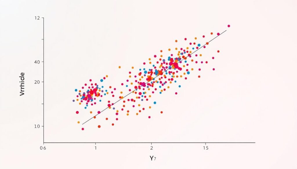
Scatter plots help us see how two things are connected. They show data points on a graph. This helps us find trends and patterns.
Key Features of Scatter Plots
Scatter plots show how data points are spread out. This can tell us a lot about the connection between variables. They help us see if things are related in a straight line or a curve.
When to Utilize Scatter Plots
- Scatter plots are great for checking if two things are connected, like price and sales.
- They help find out if two things go together well.
- They can spot odd data points that might be interesting.
Interpreting Scatter Plot Data
Looking at scatter plots means checking the direction, form, and strength of the connection. If points go up, it’s a positive connection. If they go down, it’s negative. The closer to the line, the stronger the connection.
“Scatter plots are the most useful graph for displaying the relationship between two quantitative variables in correlational studies.”
But, too many points can make it hard to see. Bubble charts can help by using different sizes for points. This adds more to our analysis.

5. Histograms: Understanding Frequency Distribution
Histograms help us see how continuous data is spread out. They group data into bins. This lets us learn about the data’s shape and what it tells us.
Difference Between Bar Charts and Histograms
Bar charts show counts of things like sales or ratings. Histograms, however, show how continuous data like scores or times are spread out.
Uses in Statistical Analysis
Histograms are great for looking at data. They show the data’s shape, find odd points, and show the data’s center and spread. By using frequency distribution bins, they help us see patterns and odd points in data.
Tips for Creating Effective Histograms
Here are some tips for making good histograms:
- Choose the right data bins or intervals.
- Make sure the x-axis scales are the same for all data.
- Label the axes and add a title to explain the data.
By following these tips, you can make histograms that clearly show what your data means. This helps with your research and talks.
6. Area Charts: Representing Cumulative Data
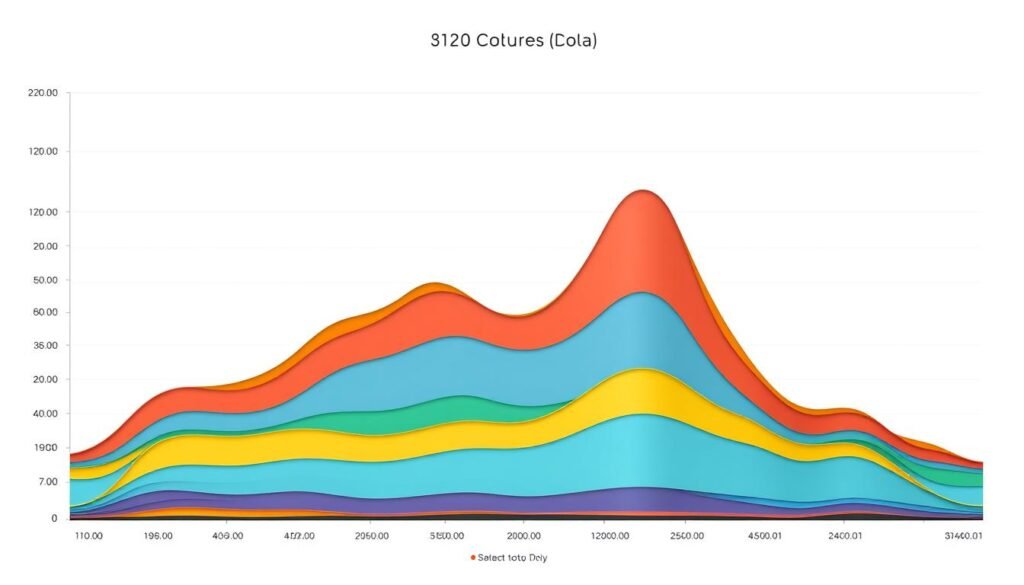
Area charts are like line charts but show how parts add up over time. They fill the space below the line. This makes trends and parts’ importance easy to see.
What Are Area Charts?
Area charts are a special kind of chart. They start with line charts but add more. They fill the space under the line, making data easier to understand.
How to Use Area Charts Effectively
Area charts work best with data that adds up. Each point should be part of a bigger picture. Trend visualization is their strong point. They’re great for showing changes in market share or website traffic.
Familiarity with Stacked Area Charts
Stacked area charts are like area charts but show more. They stack areas on top of each other. This lets us see how different parts change over time. They’re perfect for showing trends and each part’s role.

Learning about area and stacked area charts helps share complex data. It makes trends and how things work together clear. This makes research presentations more powerful.
7. Radar Charts: Comparing Multiple Variables
Radar charts are great for showing many kinds of data at once. They have axes that go out from the center. This lets you see how things compare in different ways.
Overview of Radar Charts
Georg Mayr, a German statistician, created radar charts in 1877. They’re good for showing how different things are different. The design helps spot patterns and what’s strong or weak.
Scenarios for Usage
- Analyzing player statistics in sports to assess strengths and weaknesses
- Evaluating the quality and performance of products, services, or computer programs
- Assessing the wellness habits and physical condition of individuals, such as athletes
- Comparing the effectiveness of drugs and medications in life sciences research
Benefits and Drawbacks of Radar Charts
Radar charts are great for comparing many things at once. They show patterns well. But, they can get messy with too many things. They also might not show big differences well.
| Benefits | Drawbacks |
|---|---|
|
|
“Radar charts are a valuable tool for research presentations, allowing you to easily compare and contrast the performance of multiple variables across different entities or subjects.”
8. Bubble Charts: Adding a Third Dimension to Data
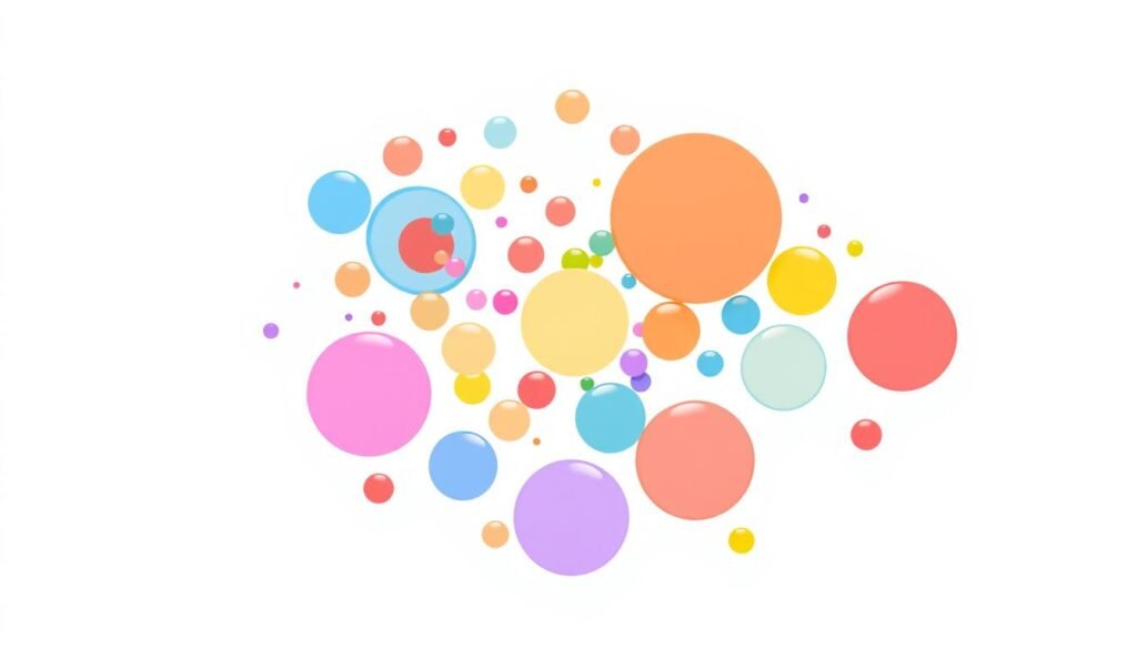
Bubble charts are a new way to see data. They show each point as a bubble. The bubble’s size, position, and color tell us three things at once.
This helps us see complex data in a new light. It shows us things we might miss in simple charts.
Description of Bubble Charts
In a bubble chart, two axes show numbers. The size of each bubble shows something else. This lets us see more about our data.
It’s great for studying things like money, people, and markets. It helps us understand how different things work together.
Best Situations for Bubble Charts
- Visualizing relationships between three numeric variables
- Identifying patterns and trends in multidimensional data
- Comparing the performance or characteristics of different entities (e.g., companies, countries, products)
- Analyzing the distribution and clustering of data points
- Highlighting outliers or exceptional data points within a dataset
Interpreting Bubble Chart Data
To understand a bubble chart, look at the axes and bubble sizes. The size of the bubble shows the third variable. It’s important to check the sizes carefully.

Learning about bubble charts helps us use data better. It lets us see how things are different and how they go together. This makes our research and decisions better.
9. Heat Maps: Visualizing Data Density
Heat maps are a great tool for showing data density and patterns. They use colors to make complex info easy to see. This makes them perfect for sharing research.
Explanation of Heat Maps
Heat maps use colors from cool blues to hot reds. They show how big or small something is. This makes it easy to spot important points in big data.
Applications in Research Presentations
In research talks, heat maps are super useful. They help show things like gene patterns, customer habits, or where things are. They turn hard data into something easy to see and understand.
Pros of Using Heat Maps
- Great for showing data density and spotting trends in big data
- Use color-coded visualization to show how big something is
- Help with matrix representation of complex info
- Make hard data easy for more people to see
- Make research talks look better and more interesting
Using heat maps can make research talks better. They grab the audience’s attention and share important findings clearly.
10. Gantt Charts: Planning and Scheduling Research Projects
Understanding Gantt Charts
Gantt charts are special bar charts. They show when things start and end in a project. This is very helpful for big research projects with lots of parts.
When to Use Gantt Charts
Gantt charts make it easy to see a project’s timeline. They are great for team projects. They help everyone know their tasks and deadlines.
They also help track how things are going. This can show where things might slow down.
Benefits of Gantt Charts in Research
Gantt charts make research plans easy to understand. They show the project’s timeline and structure clearly. This is key for planning and managing research projects well.
FAQ
What is the purpose of data visualization in research presentations?
What are the key benefits of using bar charts in research?
How are line graphs useful in research presentations?
What are the advantages and limitations of pie charts?
When should researchers use scatter plots?
How do histograms differ from bar charts, and what are their applications in research?
What are the key features and uses of area charts in research presentations?
When are radar charts (spider charts) most appropriate in research?
How do bubble charts enhance data visualization in research?
What are the benefits of using heat maps in research presentations?
How can Gantt charts assist researchers in planning and managing projects?
RELATED POSTS
View all


