Designing Effective Research Infographics: Step-by-Step Guide
November 18, 2024 | by Jean Twizeyimana
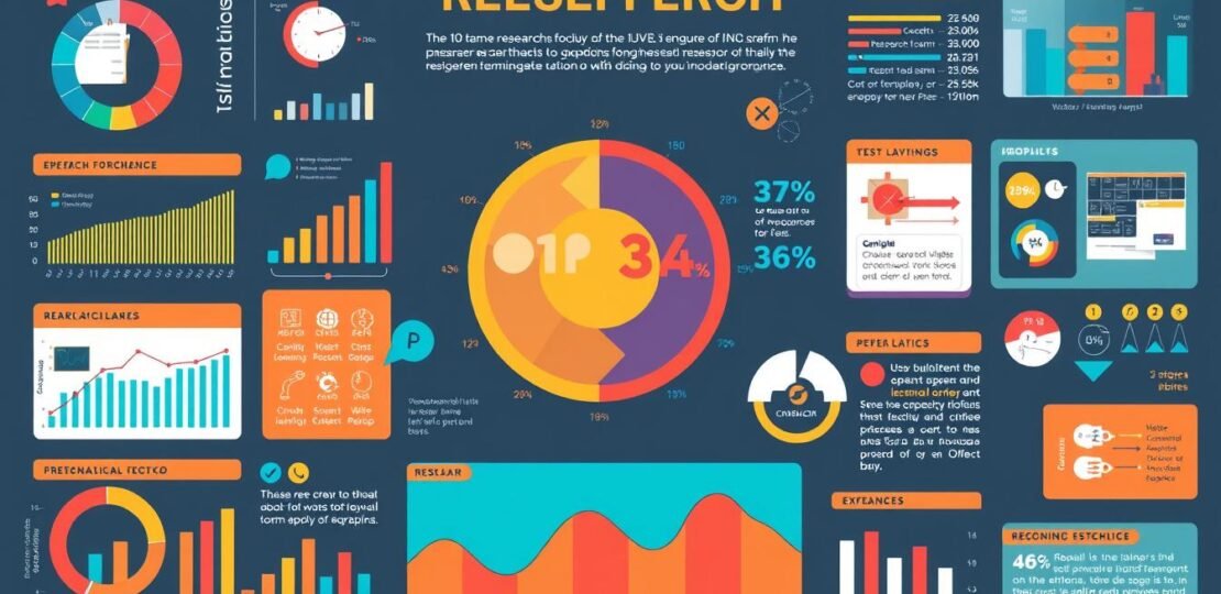
Research infographics are great for sharing findings and insights. They help explain complex ideas in a fun way. These graphics can show overviews, explain processes, and compare things.
To make a good research infographic, start by knowing what you want to say. Then, gather your data. Next, turn that data into pictures and design a nice layout. This way, you can share your message in a way that grabs people’s attention.
Key Takeaways
- Research infographics are a powerful tool for visually communicating data, information, and knowledge derived from studies.
- Infographics can increase website traffic by up to 12% and are more engaging than text-based content.
- Crafting a compelling title and selecting the right visual design and format are crucial for capturing audience attention.
- Careful data organization, logical information structuring, and impactful visual elements are essential for creating an effective research infographic.
- Seeking feedback and refining the infographic based on reviews can help ensure it resonates with the target audience.
Understanding the Importance of Research Infographics
Research infographics make complex data easy to see and understand. They use data visualization, graphic communication, and visual analytics. This makes it easy for many people to see research findings.
What is a Research Infographic?
A research infographic shows data and findings in a clear way. It can have charts, graphs, and stats. Or it can mix numbers and words to tell a story.
Benefits of Using Infographics in Research
- They help people understand better. Articles with infographics get three times more views.
- They help us remember things. Info from infographics sticks with us longer than text.
- They get shared more on social media. Infographics are shared eight times more than text.
- They make info easier to get. Infographics help people from all over understand research.
Common Applications in Various Fields
Research infographics are used in many areas. They help in:
- Market research: They show survey results and trends in a fun way.
- Healthcare: They explain medical stuff and health issues in a clear way.
- Academia: They summarize studies and make hard ideas easy to see.
- Business reporting: They compare products and show how well things are doing.
By using data visualization, graphic communication, and visual analytics, infographics are key. They help share research with many people.
“Infographics can transcend language barriers, making research more accessible to a global audience.”
Identifying Your Target Audience
Creating great research infographics starts with knowing who you’re talking to. You need to understand what your readers like and need. This way, you can make sure your infographic is just right for them.
Defining Demographics
First, figure out who your audience is. Look at their age, gender, where they live, how educated they are, and what they do. This helps you make a picture of who you want to see your infographic.
Tailoring Content for Specific Groups
- For everyone, use simple words and pictures that are easy to get.
- But for experts, you can share more detailed stuff and fancy charts.
- Change how you talk and what you say to fit what your audience expects.
The Importance of User Feedback
Getting feedback from your audience is key. It helps you make your infographics better. By listening to what people say, you can make sure your infographic really speaks to them.
“The key to creating an effective research infographic is understanding your audience and tailoring the content to their needs and preferences.” – Jane Doe, Infographic Design Specialist

Planning Your Infographic Content
Making a good research infographic takes careful planning. First, collect important data and stats from trusted sources. The U.S. makes about 2.7 million GB of data every minute. You can find lots of useful info on Google Scholar, Statista, and government data sites.
Gathering Relevant Data and Statistics
Look for the most interesting and useful data for your topic. Use reports, studies, and government stats for a full view. Then, sort the data to show key trends and findings for your infographic.
Structuring Information Logically
Now, organize the data to tell a story. Start with a clear plan for your infographic’s sections. Use a grid or wireframe to arrange your data and visuals well.
Creating a Compelling Narrative
Finally, make your infographic engaging. Use stories to make your data interesting and memorable. Add examples or anecdotes to help your audience understand and remember your points. Your goal is to inform, inspire, and entertain your readers.
“Infographics are 30 times more likely to be read than a text article.”
Designing the Visual Elements
Creating great research infographics means paying close attention to how they look. Color theory, typography, and layout design are key. Each part must be thought out to make the infographic stand out.
Choosing Color Schemes and Fonts
Start by picking 3-5 colors that go well together. Don’t use too many colors to avoid mess. Stick to 3 font types that are clear and nice to look at.
Incorporating Visual Hierarchy
Make sure the info is organized in a way that’s easy to follow. Use size, placement, and contrast to highlight key points. A little white space helps keep things simple and clean.
Ensuring Readability and Accessibility
Think about how easy it is to read the infographic. Consider font size, line spacing, and color contrast. Make sure it’s easy for everyone to see and understand, including those with vision problems.
By focusing on the visual aspects, you can make infographics that grab attention and get your message across well.

“Infographics are a valuable tool for visual communication and are often the most effective when visually unique and creative.”
Tools and Software for Infographic Creation
Making great research infographics is easy with the right tools. There are many tools, both free and paid, to help you. You can find something that fits your needs and skill level.
Popular Free and Paid Tools
Piktochart is a top free tool, loved by over 11 million users. It’s easy to use and fast. Many people have used it to get funding for their projects.
Canva is another favorite, known for its drag-and-drop editor. It has lots of templates for different fields. Venngage has 7,500 infographic templates to pick from.
If you need more, try Adobe Creative Cloud, Infogram, or Visme. They cost about $25-$29 a month. They’re great for pros and content creators.
Pros and Cons of Different Infographic Software
Think about what you need when picking infographic software. Look at ease of use, templates, data import, and collaboration. Free tools are good for simple designs. Paid tools offer more features for complex projects.
Tips for Choosing the Right Tool
Consider your design skills, project needs, and budget. Try a few tools to see which fits your style. The right tool makes creating infographics easy and fun. It helps you share your research in a cool way.
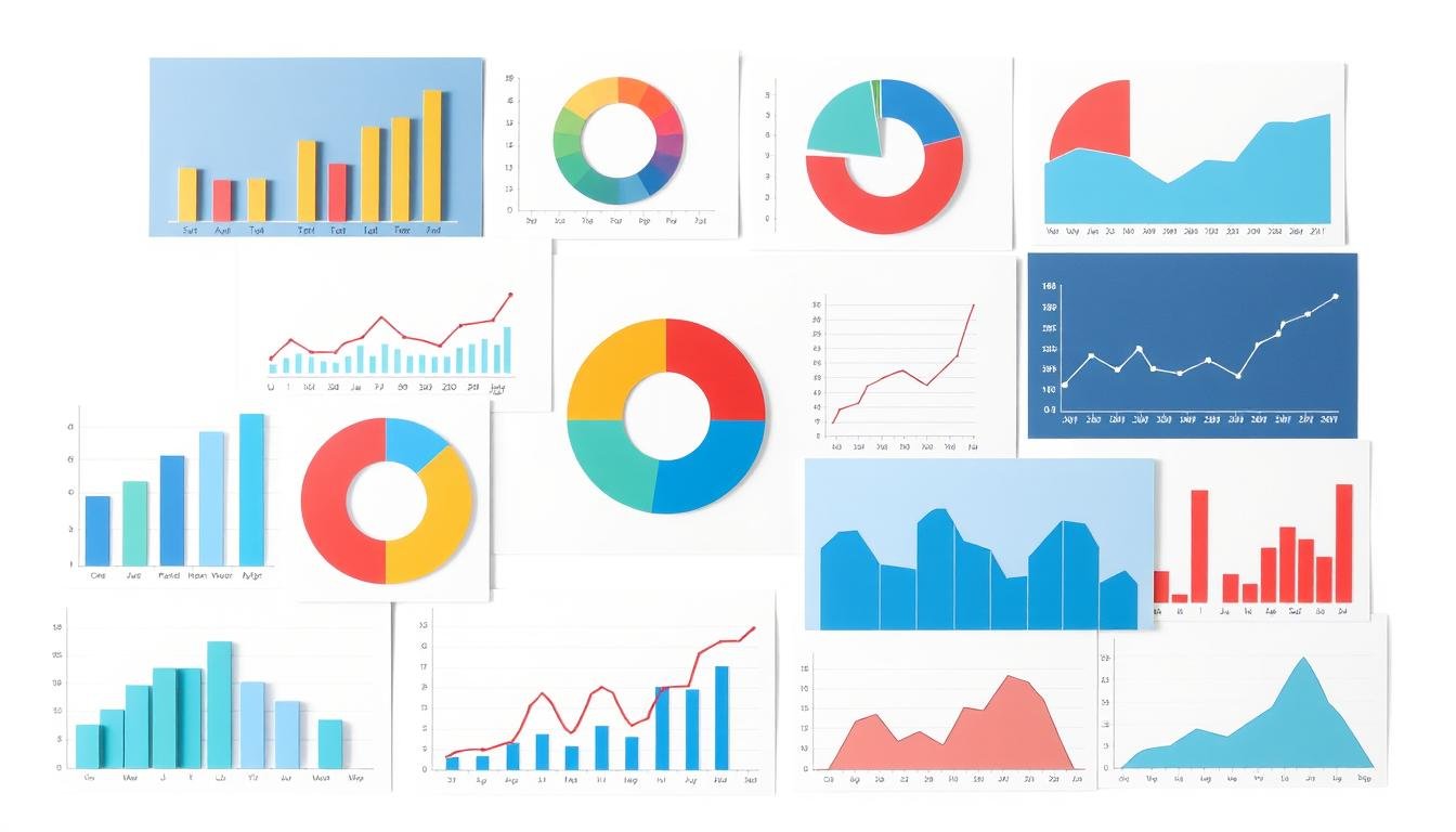
Data Visualization Techniques
Good data visualization is key to making research infographics stand out. Choosing the right charts and following best practices helps. This way, you can make complex data easy to see and understand. Let’s look at the main ways to present data and make your infographic better.
Types of Charts and Graphs
Infographics often use bar charts, line graphs, pie charts, and scatter plots. Each type has its own job:
- Bar charts are great for comparing things side by side.
- Line graphs show trends over time well.
- Pie charts and radial charts are good for showing parts of a whole.
- Scatter plots help show how data points relate to each other.
Best Practices for Data Representation
Following best practices is key for data visualization. Make sure your y-axes start at zero. Use the same scales everywhere and avoid 3D effects that can mess up how data looks. Also, pick colors that are easy to read and make important info stand out.
Avoiding Common Visualization Mistakes
It’s important to avoid common mistakes in data visualization. Don’t use too many colors, as it can confuse people. Too much info on a chart can also make it hard to understand. And, choose the right chart type for your data to avoid confusing your viewers.
By learning these data visualization tips, you can make your research infographics better. You’ll grab your audience’s attention with clear, interesting, and useful data.
Enhancing Engagement with Interactive Elements
Interactive infographic design makes things more fun and interesting. It helps people enjoy learning more. With cool features like animations, infographics become more than just pictures.
What is Interactive Infographic Design?
Interactive infographics let you play with data. You can click, hover, and filter to explore. It’s like a game that teaches you stuff.
Benefits of Interactivity
- More people stay longer and have fun
- They learn more because it’s interactive
- They remember things better because it’s fun
- It makes the infographic stand out
Tools to Create Interactive Infographics
There are many tools to make cool infographics. Tableau, Infogram, and D3.js are some popular ones. They help you add fun features without making it too hard.
| Tool | Key Features | Pricing |
|---|---|---|
| Infogram |
|
Free plan available, paid plans start at $19/month |
| Tableau |
|
Paid plans start at $70/user/month |
| D3.js |
|
Open-source, free to use |
Interactive design makes learning fun. It helps people understand complex stuff better. As we move forward, using interactive design, user experience, and digital engagement will be key.
Testing and Refining Your Infographic
Making a good research infographic takes time. First, you design it. Then, you ask others for their thoughts. This helps you make it better and clear.
Gathering Feedback from Peers
Show your infographic to many people. Include experts, designers, and those you want to reach. Ask for honest feedback on how easy it is to understand and how it looks.
Listen to what they say and change it if needed.
Iterating on Design Based on Reviews
Use what others said to make your infographic better. You might change the layout, colors, or fonts. This makes it easier to read and look good.
Pay attention to where people got confused.
Final Checks Before Publishing
Before you share it, check it carefully. Make sure the facts are right and there are no mistakes in spelling or grammar. The design should look good and make sense.
Check the charts and graphs too. They should show the data correctly. Only then is it ready to share.

Testing and improving your infographic makes it better. It will look great and share your important findings well.
Promoting Your Research Infographic
To make your research infographic known, you need a good plan. Share it on social media sites. Pick the right time and format for each site. Twitter, LinkedIn, and Instagram are great for showing off your infographic.
Share on Social Media Platforms
Write captions that grab people’s attention. Ask questions or share important points from your research. Use hashtags to help people find your post. Always talk back to comments to keep the conversation going.
Collaborating with Influencers and Scholars
Find famous people in your field and work with them. Ask them to share your infographic or add quotes. This way, more people will see your work and think it’s credible.
Measuring Success and Engagement Metrics
Watch how your infographic does by looking at views, shares, likes, and comments. See if it helps your research get out there more. Use what you learn to make your next infographic even better.
FAQ
What is a research infographic?
What are the benefits of using research infographics?
What are the common applications of research infographics?
How do I identify the target audience for a research infographic?
What steps are involved in planning the content of a research infographic?
What are the key considerations for the visual design of a research infographic?
What tools and software are available for creating research infographics?
How can I ensure effective data visualization in my research infographic?
What are the benefits of creating interactive research infographics?
How can I test and refine my research infographic before publishing?
How can I effectively promote my research infographic?
RELATED POSTS
View all
Choosing the Right Chart Type for Your Research Data
November 19, 2024 | by Jean Twizeyimana

Best Research Planning Software: Complete Guide for Academics (2024)
November 15, 2024 | by Jean Twizeyimana

AI Writing Assistance Tools: How AI Can Help You Craft Better Research Papers Now
November 17, 2024 | by Jean Twizeyimana