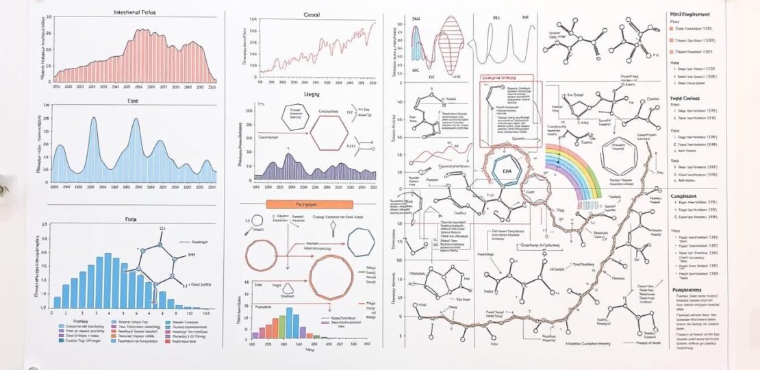
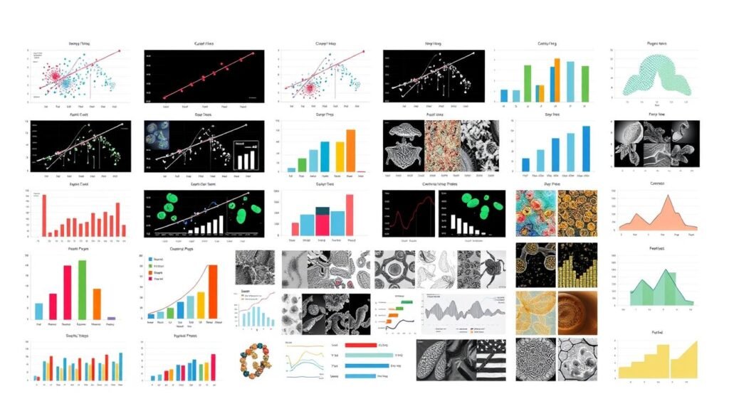
How to Make Scientific Figures for Publication
November 18, 2024 | by Jean Twizeyimana

I know how important scientific figures are in research papers. They grab the reader’s attention first. They show information quickly, unlike text.
Creating great figures means picking the right plots and keeping designs simple. You also need to adjust scales and captions. This article will help you make figures that are clear and follow scientific standards.
Key Takeaways
- Scientific figures are crucial for visual representation of key findings in research papers.
- Each figure should communicate one clear message, ideally representing a conclusion or part of it.
- The figure creation process involves selecting appropriate plot types, minimizing data presentation, and simplifying design elements.
- Proper captioning and consistent design across figures are essential for effective communication.
- Adhering to journal guidelines and best practices is crucial for creating publication-ready figures.
Importance of Scientific Figures in Research
Scientific figures are key in research papers. They show important findings in a visual way. This helps people understand and connect with the data better.
Good figures make complex ideas easy to see. They are vital for sharing science well.
Visual Communication in Science
The brain likes pictures more than words. Scientific illustrations use this to help us get data fast. They turn hard ideas into pictures we can remember.
Good pictures grab our attention. They make science interesting and easy to remember.
Enhancing Data Interpretation
Good chart design principles are key for showing data. The right graphs and colors make data easy to see. This helps us understand the data better.
Engaging Your Audience
It’s important to keep the audience interested. Pictures that are both pretty and informative do this well. They make science fun and interesting.
“Figures are the central part of almost every scientific paper. The brain can register images faster than text.”
In short, figures are very important in research. They help us see data, understand it, and get excited about it. Learning to make great figures is a skill every researcher should have.
Types of Scientific Figures
Scientific figures are many and each is good for different kinds of data. You might use graph plotting software or other data visualization techniques. Knowing what each figure is best for helps you show your research well.
Charts and Graphs
Charts and graphs, like bar charts and scatter plots, are great for numbers. They make it easy to see trends and patterns in data. This helps readers quickly get the point of the data.
Diagrams and Schematics
Diagrams and schematics show how things work or are connected. They help explain hard ideas in a simple way. These are good for showing how things work in biology, chemistry, or engineering.
Photographs and Illustrations
Photos and drawings give a close-up look at things. They help readers understand what’s being studied better. This makes the research more interesting and clear.
Infographics
Infographics mix charts, graphs, and pictures to share lots of info. They make complex data easy to see and understand. This helps grab the audience’s attention and makes the message clearer.
Choosing the right figure depends on the data and what you want to say. The right figure makes your research easy to follow and more fun to read.
| Figure Type | Optimal Use | Advantages |
|---|---|---|
| Charts and Graphs | Quantitative data visualization | Clearly display trends, patterns, and relationships in numerical data |
| Diagrams and Schematics | Illustrating processes, structures, or relationships | Explain complex concepts or mechanisms in a visual format |
| Photographs and Illustrations | Providing visual evidence or depicting complex structures | Offer a more detailed and engaging view of the subject matter |
| Infographics | Communicating comprehensive information in a visually appealing way | Leverage the power of visual communication to engage the audience and enhance understanding |
“Figures are used to engage the audience visually and capture their attention.”
Choosing the Right Software
Choosing the right software for making scientific figures is key. There are many options, like commercial and open-source tools. Each has its own strengths and uses. Knowing what you need helps you pick the best software for your work.
Popular Software Options
R is a top choice for making charts and graphs. It’s free and open-source. It has lots of packages for different needs.
ImageJ is great for editing images. It’s free and used a lot in science.
Open-Source Tools
There are also open-source tools that are cost-effective. Inkscape is a free vector graphics editor. It’s good for editing and annotating images.
Assessing Your Needs
Think about your data and figure needs when choosing software. Pick software that fits your needs and skills. This way, your figures will be good and easy to make.

Designing Effective Graphs
Making graphs that are easy to see is key to sharing your data well. Pick the right graph type based on what you want to show. Bar charts are great for comparing things, like how different groups do. Line graphs show trends over time. Pie charts help us see how big each part is compared to others.
Selecting Appropriate Graph Types
Choose a graph type that fits your data and message. Bar charts are good for showing differences, like in experiments or product sales. Line graphs are best for tracking changes over time. Scatter plots help find links between two things, showing patterns and connections.
Color Theory and Accessibility
Using color wisely can make your graphs clearer and more impactful. Stick to color theory by picking colors that work well together. Make sure colors are easy to see for everyone, especially those with color blindness. Don’t use red and green together, as it’s hard for many to tell apart.
Scaling and Proportions
It’s important to get the size and scale of your graphs right. Make sure your data is shown clearly without stretching it. Keep the scale the same in similar graphs for easy comparison. Pay attention to how big and where things like labels and marks are placed to make your graph look good.
“Effective data visualization is not just about making pretty pictures – it’s about clearly and accurately communicating complex information in a way that engages the viewer and facilitates understanding.”
Creating Professional Diagrams
Making diagrams that look good is key to sharing complex ideas. They help show how things work or how they’re connected. The right diagrams grab your audience’s attention and help them get your research.
Flowcharts and Process Diagrams
Flowcharts and process diagrams show steps or how things interact. Keep them simple and clear. Use the same symbols and colors to make them easy to follow.
Break down big processes into smaller parts. This helps your audience understand better, step by step.
Making Complex Concepts Clear
Illustration and visual communication are key in making hard ideas easy to get. Good diagrams turn complex ideas into something fun and informative. Try breaking down big diagrams into smaller ones to help people remember better.
Tools for Diagram Creation
- Specialized diagram software, such as Lucidchart or Microsoft Visio, offer robust features for creating professional-grade flowcharts and process diagrams.
- General-purpose vector graphics programs, like Adobe Illustrator or Inkscape, provide greater flexibility in designing custom diagrams and illustrations.
- Explore open-source alternatives, such as LibreOffice Draw or yEd Graph Editor, which can be cost-effective options for diagram creation.
Choose a tool that lets you design freely and export easily. This way, your diagrams will look great in your scientific papers.
“Diagrams are not just decorative elements; they are powerful tools that can enhance the communication of complex scientific ideas. Invest time in creating visually engaging and informative diagrams to elevate the impact of your work.”
Best Practices for Figure Layout
Making great figures for your science work needs focus and a good eye for detail. It’s key to keep the look of all your images the same. This makes your work look better and easier to understand.
Consistency in Design
Use the same colors, symbols, and fonts for each part of your figures. This helps your readers see and compare the data easily. Keep your figures looking good together, like your whole guide.
Spacing and Alignment
It’s important to space and align your figure parts well. Use a hidden grid to line up labels, axes, and data points. This keeps things neat and easy to see.
Text and Label Legibility
Your figure text and labels should be clear and easy to read. Choose fonts that match your article’s text. Make sure your figures are the right size and resolution for high-quality prints.
| File Type | Resolution (dpi) | Size |
|---|---|---|
| Line Art | 600 | At least 80mm or 1800 pixels wide |
| Images | 300 | At least 80mm or 1800 pixels wide |

“Attention to detail and consistency in figure design can make a significant impact on the clarity and impact of your scientific work.”
By following these tips, your figures will look great and share your research well. This will help your work have more impact.
Incorporating Data Effectively
When making scientific figures, using data well is key. You need to pick, simplify, and show the data right. The goal is to share only what’s needed to back up your findings. This means avoiding figures that are too full or hard to understand.
Data Selection and Simplification
Start by choosing the data you want to use in your figures carefully. Don’t try to show too much. Focus on the most important data that shows what you found. By making the data simpler, your figures will be easier to get and understand.
Highlighting Key Information
After picking the right data, make sure to highlight the most important parts. Use colors, sizes, and other visual hints to draw attention. For example, you can use colors to show different data sets or make some points bigger than others.
Avoiding Misleading Representations
When adding data to your figures, be careful not to mislead. Don’t change the data’s size in a way that changes how it looks. Also, be careful not to show only some data, which can make things seem biased. Always be clear about how you handled the data to keep your findings honest.
Good data visualization is a big part of making scientific figures. By choosing, simplifying, and highlighting the right data, you can share your findings clearly. This way, your figures will not only show what you found but also grab your audience’s attention. The goal is to find a balance between showing enough and being clear, so your data helps tell your scientific story well.
| Recommended Practices | Potential Pitfalls |
|---|---|
|
|
“The true beauty of data visualization lies in its ability to transform complex information into a clear, compelling narrative.”
Captioning Your Figures
Creating effective captions for scientific figures is key. It helps your work be understood and appreciated. Captions connect the visual and the reader, making key findings clear at a glance.
Writing Descriptive Captions
Start with a clear title that shows the main result. This grabs the reader’s attention. Then, explain all parts of the figure and any needed method details.
Make captions that let readers understand the results easily. They should not need to keep looking back at the main text.
Including Relevant Information
Your captions should have all the needed context and details. Define any special terms or symbols used. This helps both experts and non-experts understand.
Also, include important experimental conditions. This gives a full picture of the data shown.
Maintaining Clarity and Conciseness
Your captions should be clear and to the point. Stick to a 200-250 word limit. This keeps them focused on the essential information.
Don’t include your own interpretations in the captions. Just describe what you show. This makes your captions clear and easy to follow.
| Characteristic | Recommendation |
|---|---|
| Caption Length | Typically 200-250 words |
| Caption Structure |
|
| Caption Content |
|
By following these tips, you’ll improve your visual communication. This is key to sharing your research clearly and effectively.
File Formats for Publication
Choosing the right file format is key for publication-quality figures. Vector formats like EPS and PDF are great for line art. They keep edges sharp and can be scaled without losing quality. Raster formats, such as TIFF and PNG, are better for images and photos.
Common File Types and Their Uses
- EPS and PDF: Preferred for line art, as they support vector-based graphics and can be scaled without losing resolution.
- TIFF and PNG: Suitable for images and photographs, providing high-quality raster-based representations.
Quality Considerations
Make sure your figures meet the publication’s resolution needs. For line art, aim for 600 dpi. Images should be at least 300 dpi. Also, keep each figure’s file size under 10 MB.
Publisher Requirements
Always follow the file format and size rules given by the journal or publisher. These rules can change, so check the submission guidelines well. If unsure, submit a high-quality PDF file first. This format is widely accepted.

Use clear and descriptive file names. For example, “Figure_1.tiff”. This makes the publication process smoother and more organized.
Ensuring Compliance with Journal Standards
Making great figures is key, but it’s not all. You must also follow the journal’s rules. This makes sure your work goes smoothly and gets published.
Understanding Submission Guidelines
Before you finish your figures, read the journal’s rules carefully. They tell you about file types, image quality, size, and names. Knowing these can save you a lot of trouble later.
Adhering to Format Specifications
Each journal has its own rules for files, like TIFF or JPEG. You also need to keep images sharp, at least 300 dpi for print. Make sure your figures are the right size and look right, following any special rules.
Common Pitfalls to Avoid
- Submitting low-resolution or blurry images that fail to meet the journal’s quality standards.
- Improperly formatting or labeling your figures, leading to confusion or misinterpretation.
- Neglecting to provide clear, concise captions that accurately describe the content of your figures.
- Failing to properly cite the sources of any data or images used in your figures.
- Engaging in unethical image manipulation, such as selectively cropping or altering data.
By following the journal’s rules closely, you can make sure your figures are accepted. This helps share your research clearly.
Peer Review and Feedback
Creating great scientific figures is important. Getting feedback from others is key. It helps make your figures better and clearer.
Importance of Colleague Input
It’s smart to ask others to review your figures. They can spot things you might miss. Their help makes your figures better and clearer.
Handling Critiques Professionally
When you get feedback, listen well. It’s okay to change your work for the better. Talking with your reviewers can make your figures even stronger.
Implementing Feedback in Revisions
After feedback, it’s time to make changes. You might need to make your figures clearer or add more details. Being open to feedback makes your figures better.
By using feedback well, you can make your figures even more powerful. This helps share your research with others in a clear way.
Resources for Continued Learning
Getting better at making scientific figures is a journey. There are many ways to keep learning. You can find books, articles, online courses, and even join groups for scientists.
Recommended Books and Articles
“Ten Simple Rules for Better Figures” by Rougier et al is a great read. It teaches you how to make your data look good. “Ten guidelines for effective data visualization in scientific publications” by Kelleher et al also helps a lot. It shows you how to make your figures easy to understand.
Online Courses and Tutorials
There are lots of online classes on data visualization and drawing science pictures. Sites like Coursera, Udemy, and edX have many courses. They teach you how to use Python for data pictures and the basics of scientific drawing.
Joining Professional Organizations
Think about joining groups for science writers and scientists. The National Association of Science Writers (NASW) and the American Association for the Advancement of Science (AAAS) are great. They have resources, places to meet people, and events. Going to their workshops or meetings can teach you a lot and let you work with others.
FAQ
What is the importance of scientific figures in research papers?
What are the different types of scientific figures?
What software options are available for creating scientific figures?
What are the key principles of effective graph design?
How can I create professional-looking diagrams?
What are the best practices for figure layout and design consistency?
How can I effectively incorporate data into my scientific figures?
What should I include in figure captions?
What file formats and resolution requirements should I consider for publication-quality figures?
How can I ensure my figures comply with journal guidelines?
How can I improve my scientific figure creation skills?
RELATED POSTS
View all


